Panna Elena
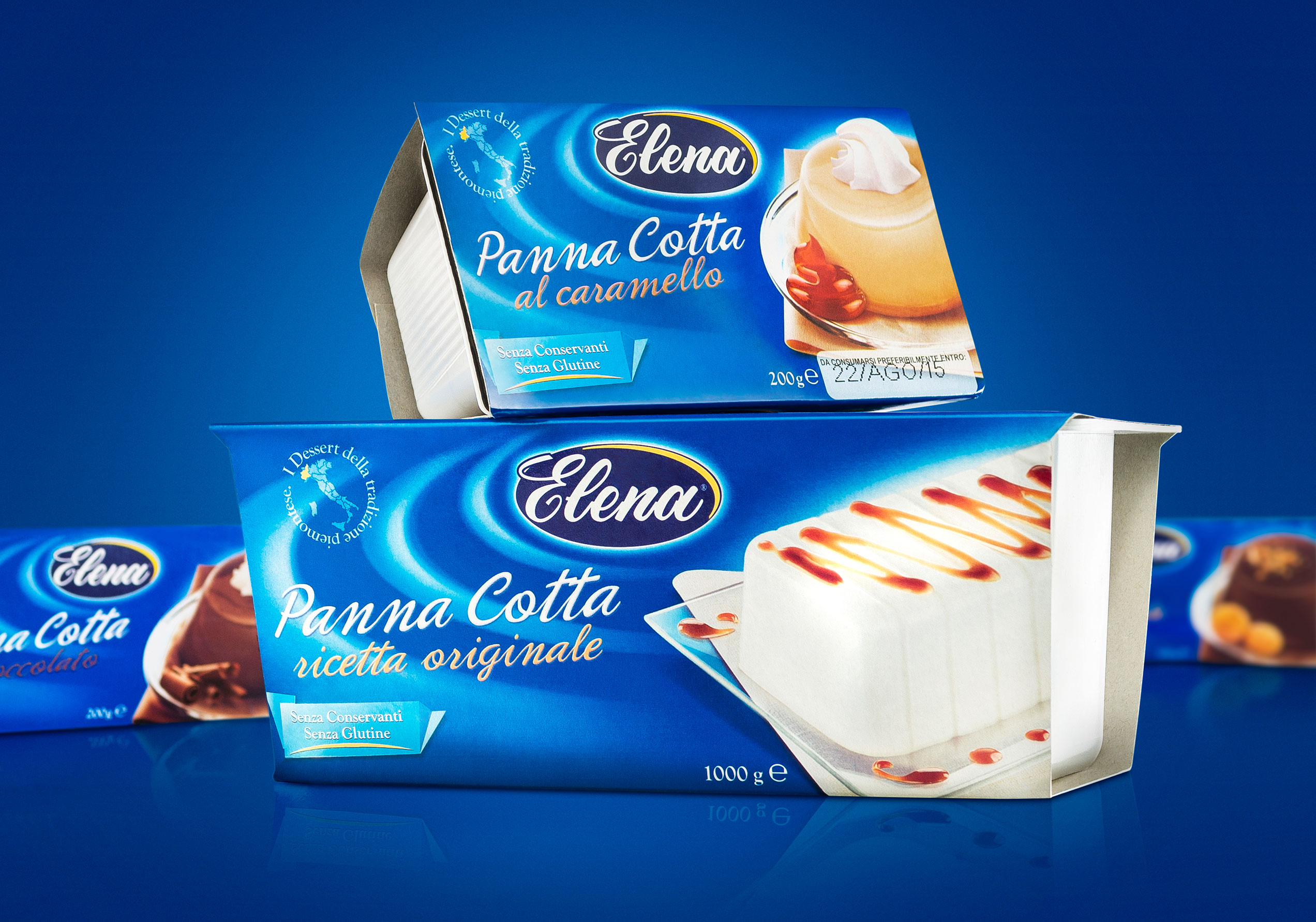
How to give a new appetite appeal to the Elena desserts’ image that is the historical brand of Northern Italy? Our method show a new freshness for an entire line of products (bunet, cream pudding, pudding and creme caramel) with an old-fashioned image, destined to the GDO distribution.
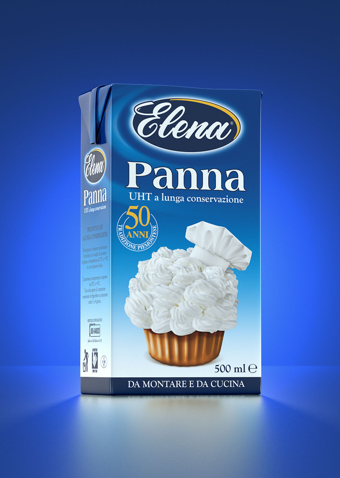
We have re-agened the packaging without distorting it, through the study and development of a brand area that can communicates freshness and creaminess, a color code that describes a right impact into the sale point and a visual that tempt the consumer.

The restyling has been tested to consumers whose have liked the change of image.


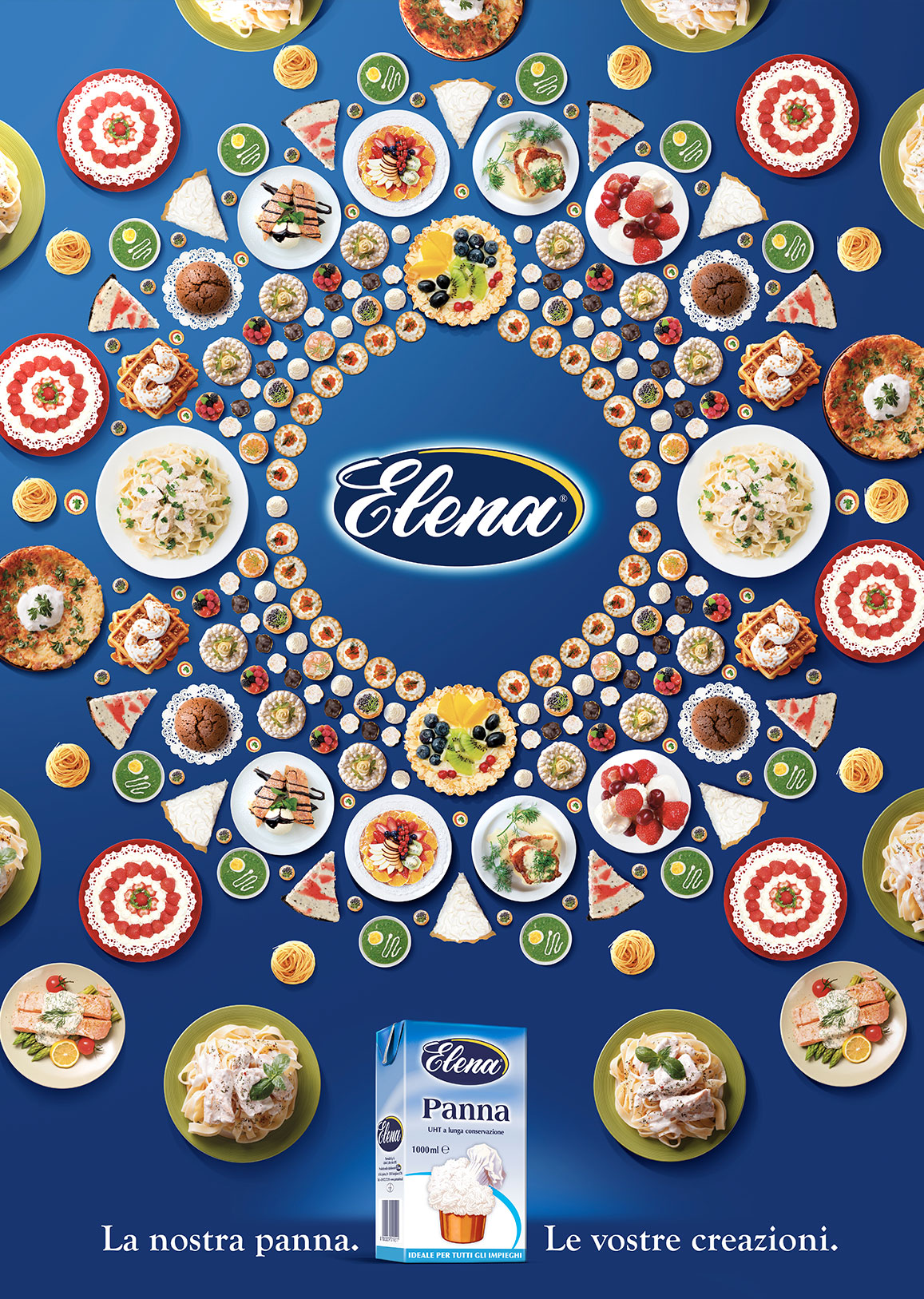
Since 2013 Spider takes care of all Elena’s image and communication for both on GDO distribution and HO.RE.CA, developing ATL, BTL activities, branding and packaging.


