Toren – Mr. Bite Groan
A look that leaves you wide-eyed.
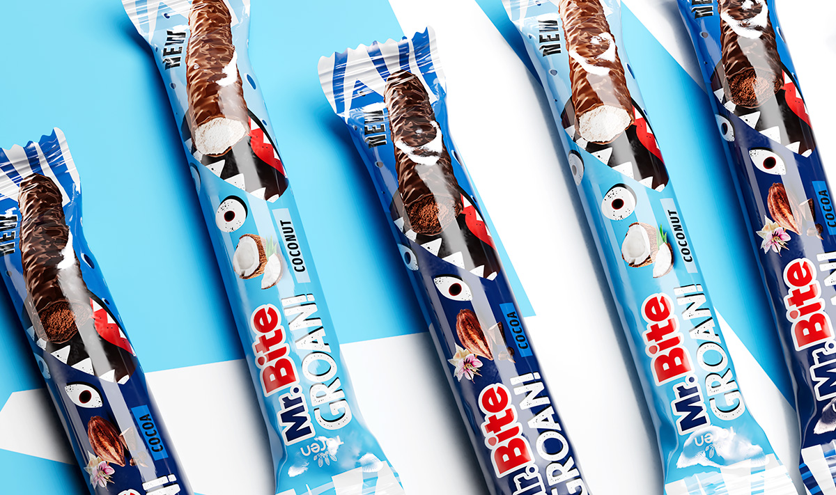
Toren’s portfolio gains a bold new addition with Mr. Bite Groan, an extension of the Mr. Bite brand. Spider handled the full creation, from visual identity development to packaging across all product lines.
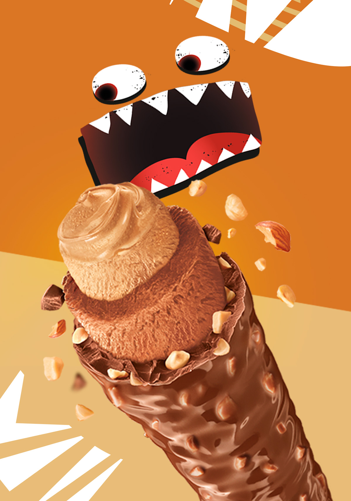
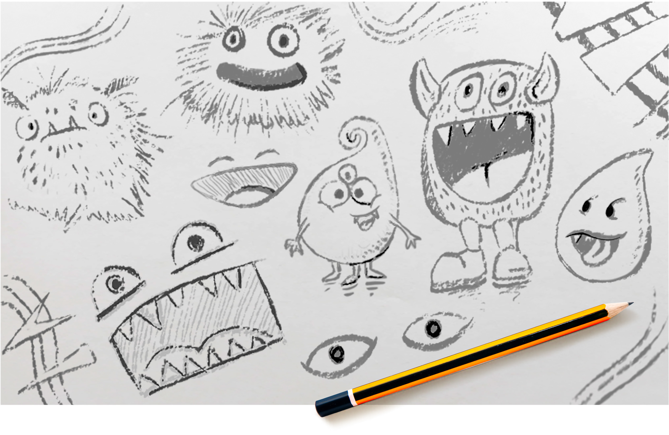
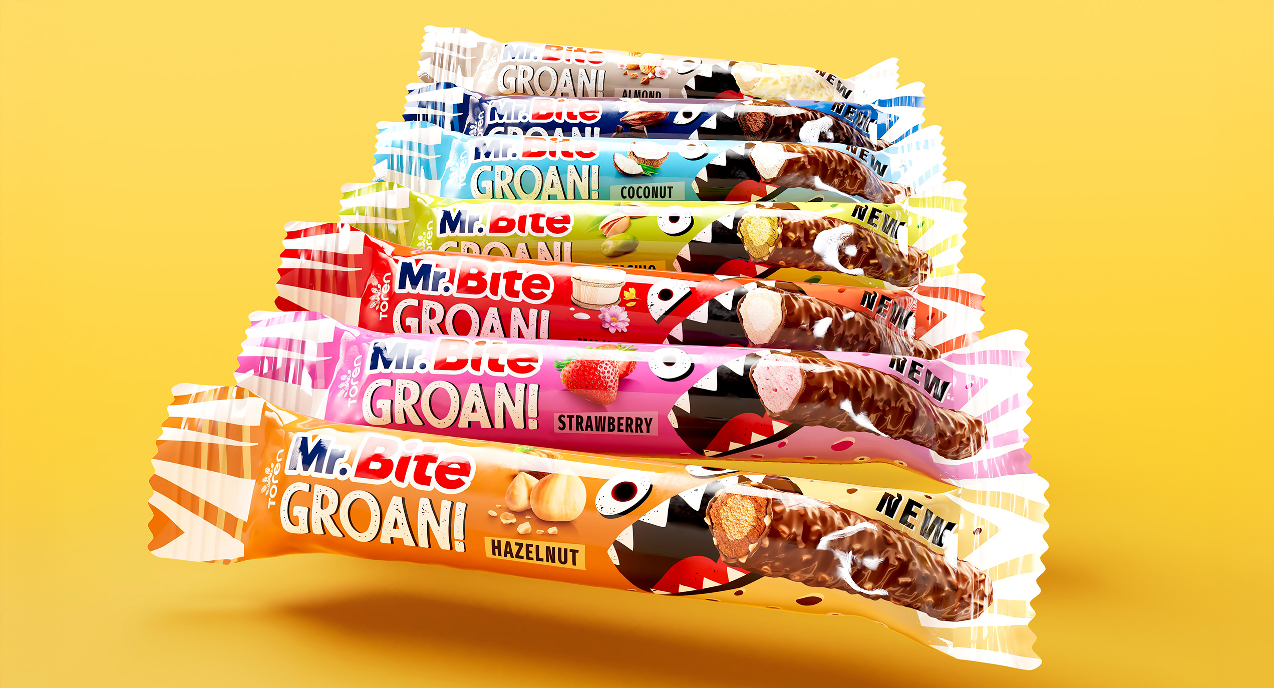
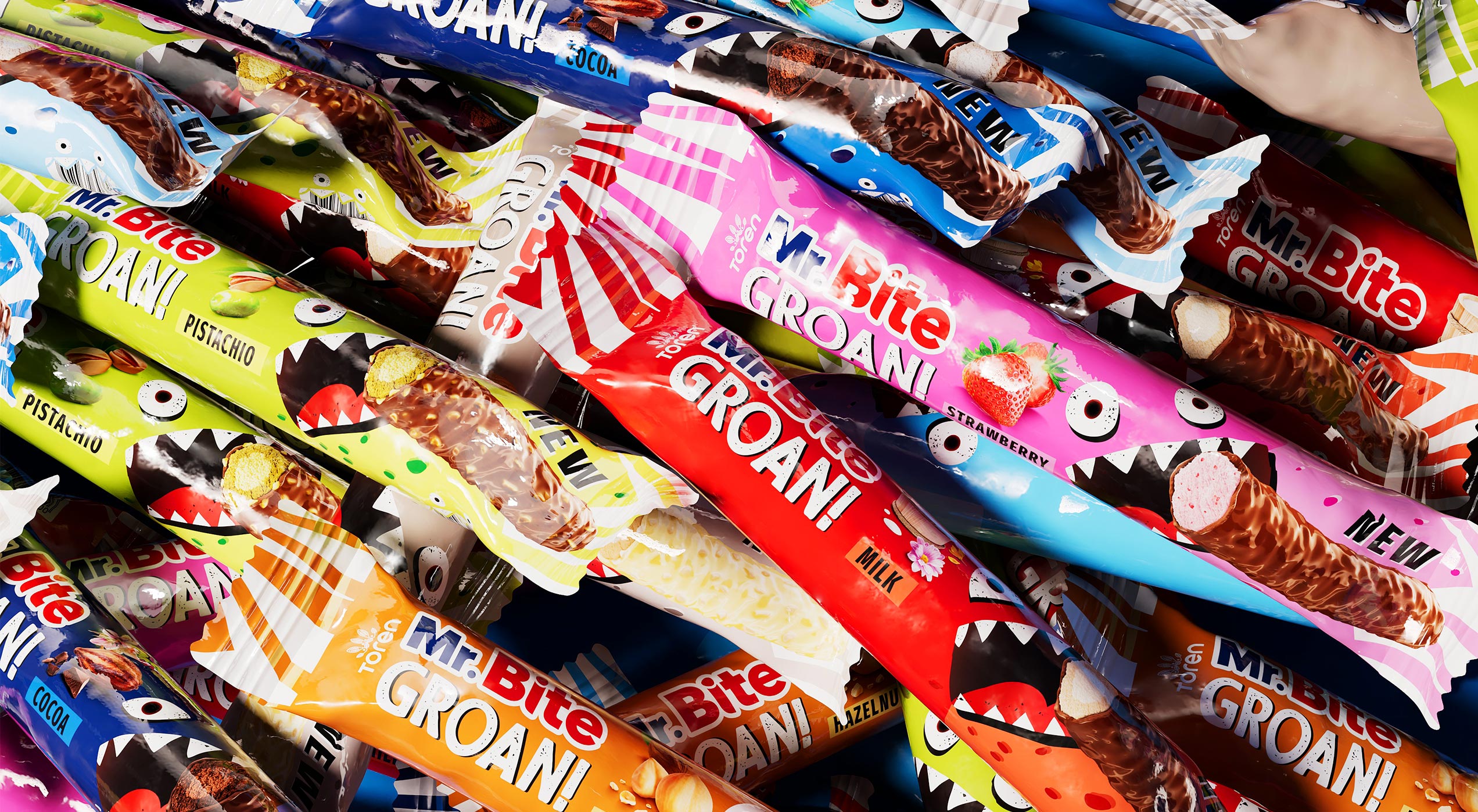
The name “Groan” was created to evoke both the snack’s irresistible crunch and its cheeky, playful spirit. The logo reinforces this through a texture-inspired design, while a quirky monster character evolves across seven flavor variants to embody the brand’s expressive personality.
From digital illustrations and product visuals to packaging design and multipack systems, Spider oversaw the entire journey of the product’s visual identity, including all flavor variations.
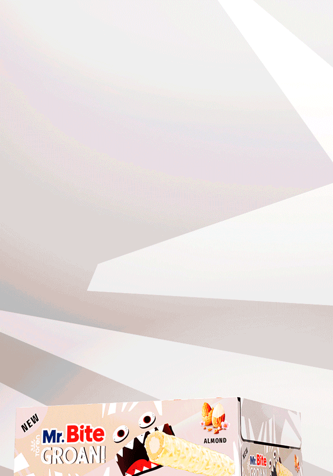
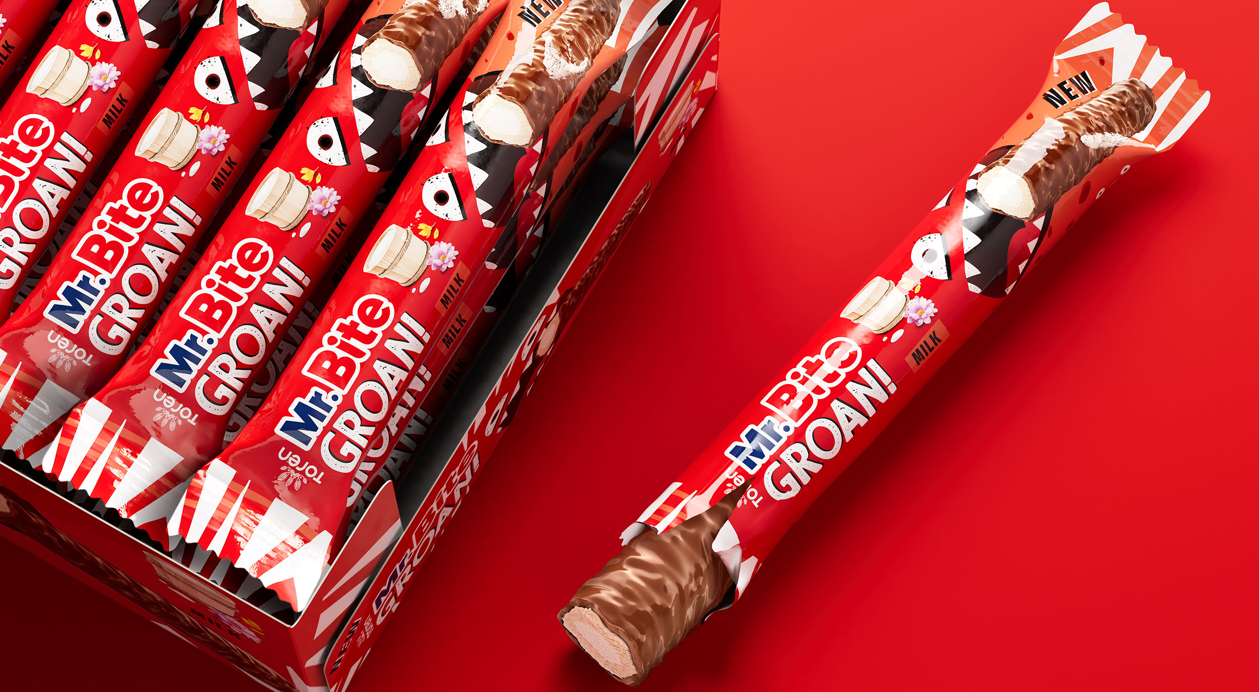
The playful, cheeky tone carries over to the packaging, where each flavor, milk, dark, hazelnut, strawberry, pistachio, coconut, and almond, gets its own pop of bold, vibrant color while staying part of a cohesive family.
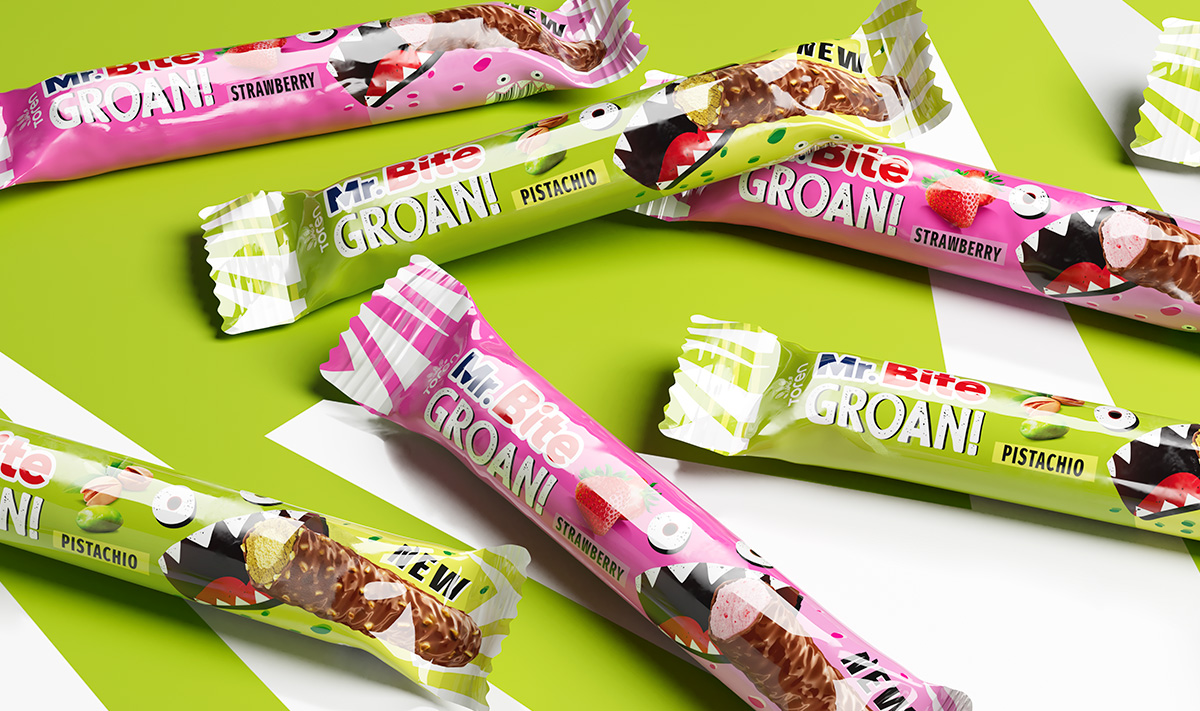
Designed to scale across multipacks and displays, the packaging system guarantees standout impact at shelf and brand coherence across formats.