Parmalat – Panna Elena
An identity with a flavor that embraces.
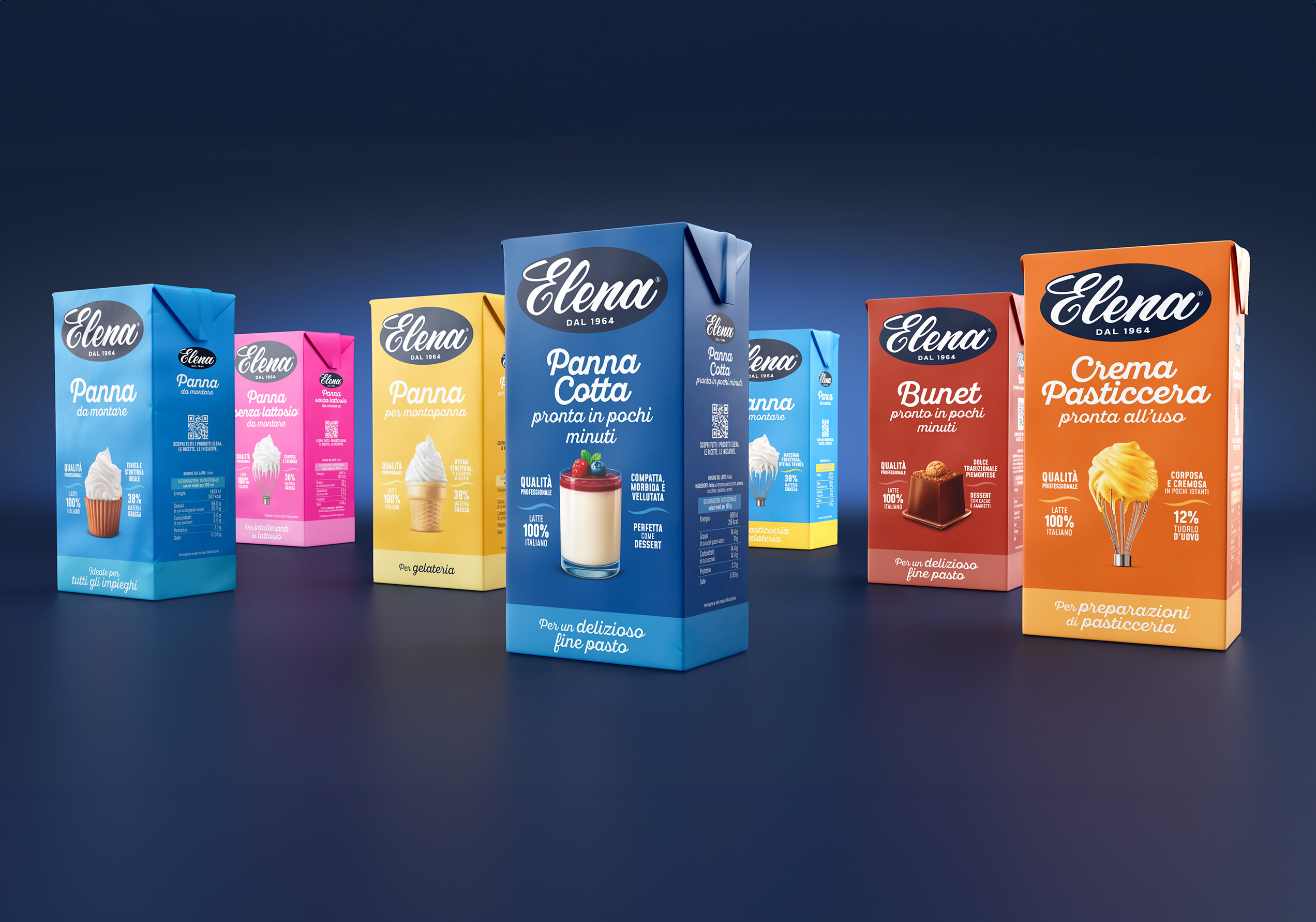
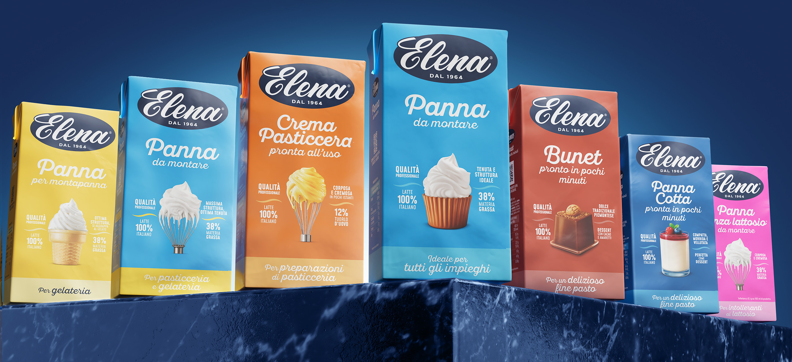
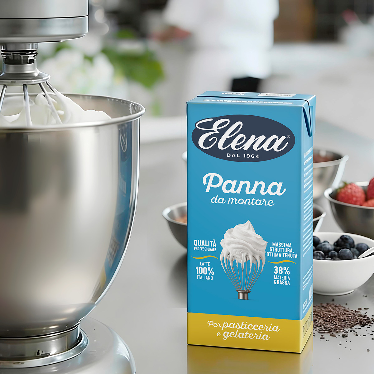
When a brand has such a long-standing history, repositioning requires a solid structure. That’s why Spider developed a measured restyling, striking a precise balance between heritage and renewal. The goal of the repositioning was clear: convey greater reliability and quality to industry professionals, while projecting freshness and contemporary appeal to retail consumers.
Spider started with the logo, refining it for cleaner lines and improved readability. The wordmark was simplified while staying true to its core. The result is a more balanced, stronger logo that seamlessly interacts with a contemporary visual system while preserving its historic character. Adding the founding year reinforces the brand’s heritage and reinforcing its standing.

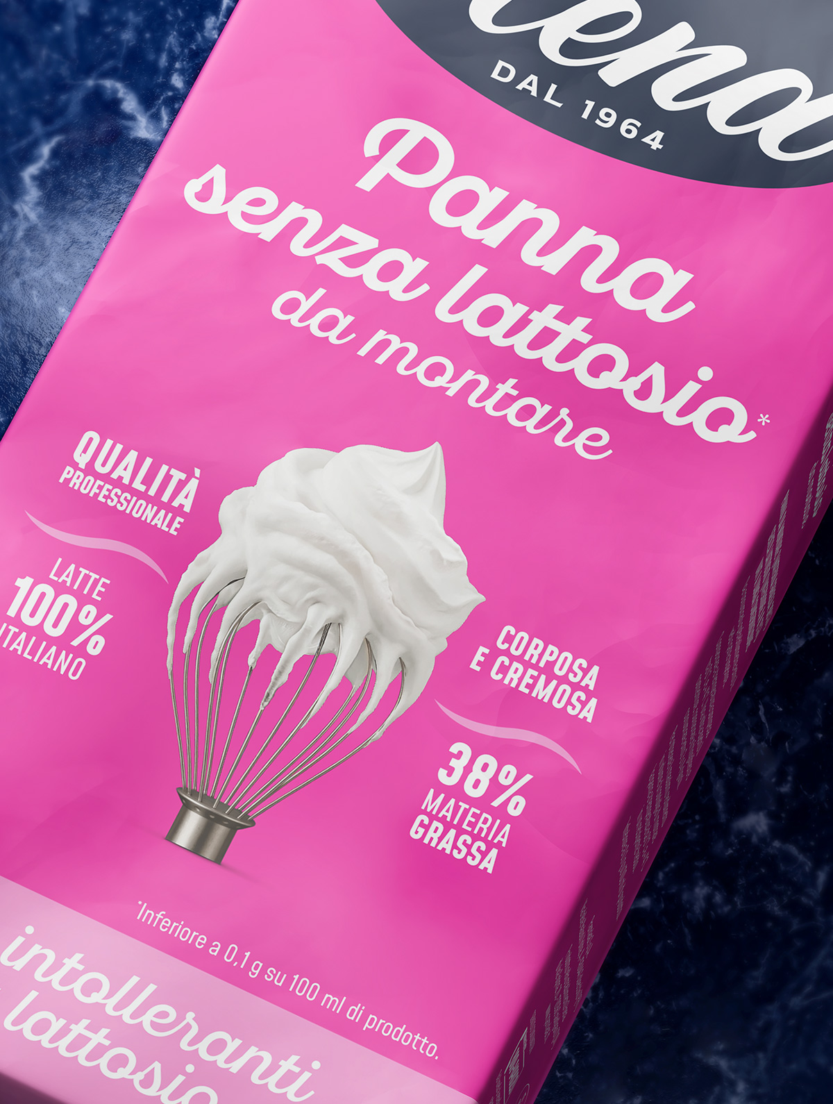
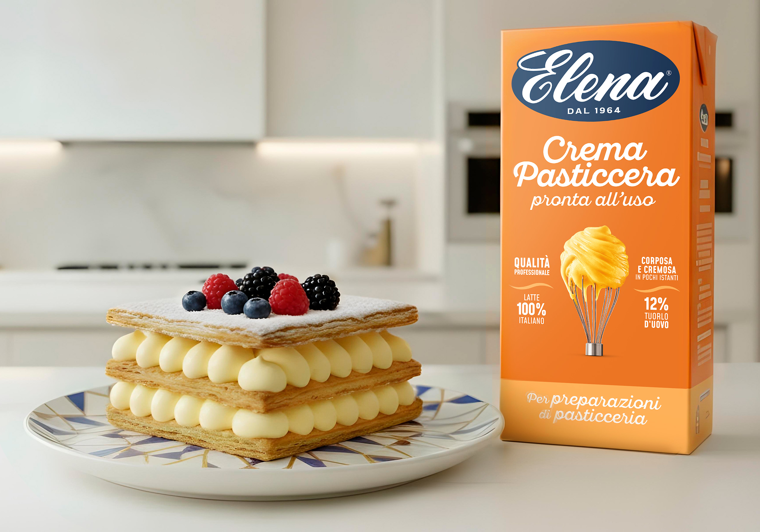
Creaminess on display.
Key visuals have been redesigned to highlight the quality of the ingredients while showcasing professional performance, without ever losing their appetite appeal. Elena was born for professionals, yet grew up in home kitchens. Each SKU is defined by a distinct color and visual, clearly signaling its intended use.


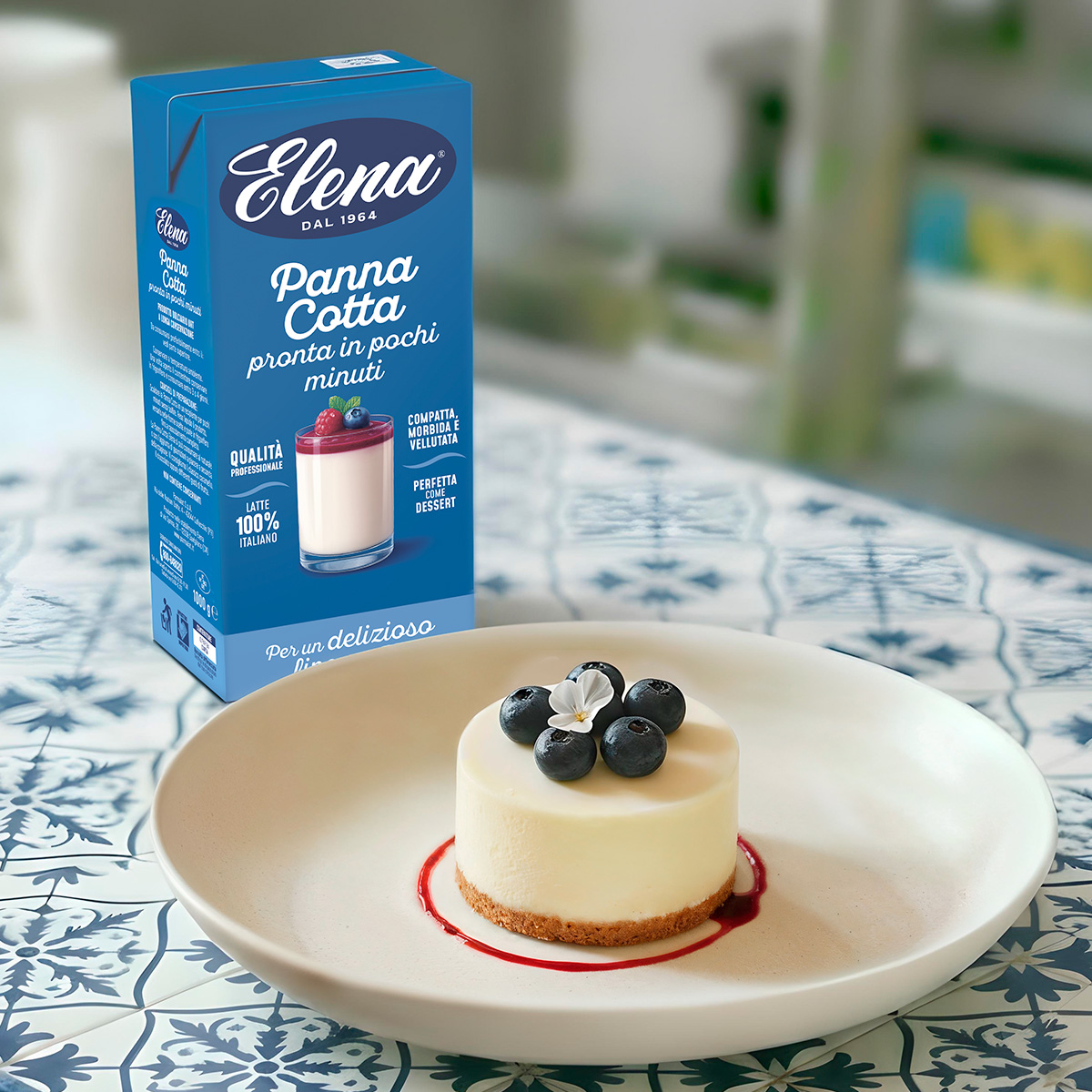
The result is a line crafted to perfection, “ready” to reveal its full sweetness.