Ulker – Oneo Restyling
Time to refresh!
Spider gave Ulker’s chewing gum brand Oneo a full visual refresh, bringing the same crisp, fresh feeling of the gum straight to its packaging. The new visual identity needed to boost brand visibility while remaining instantly recognizable.
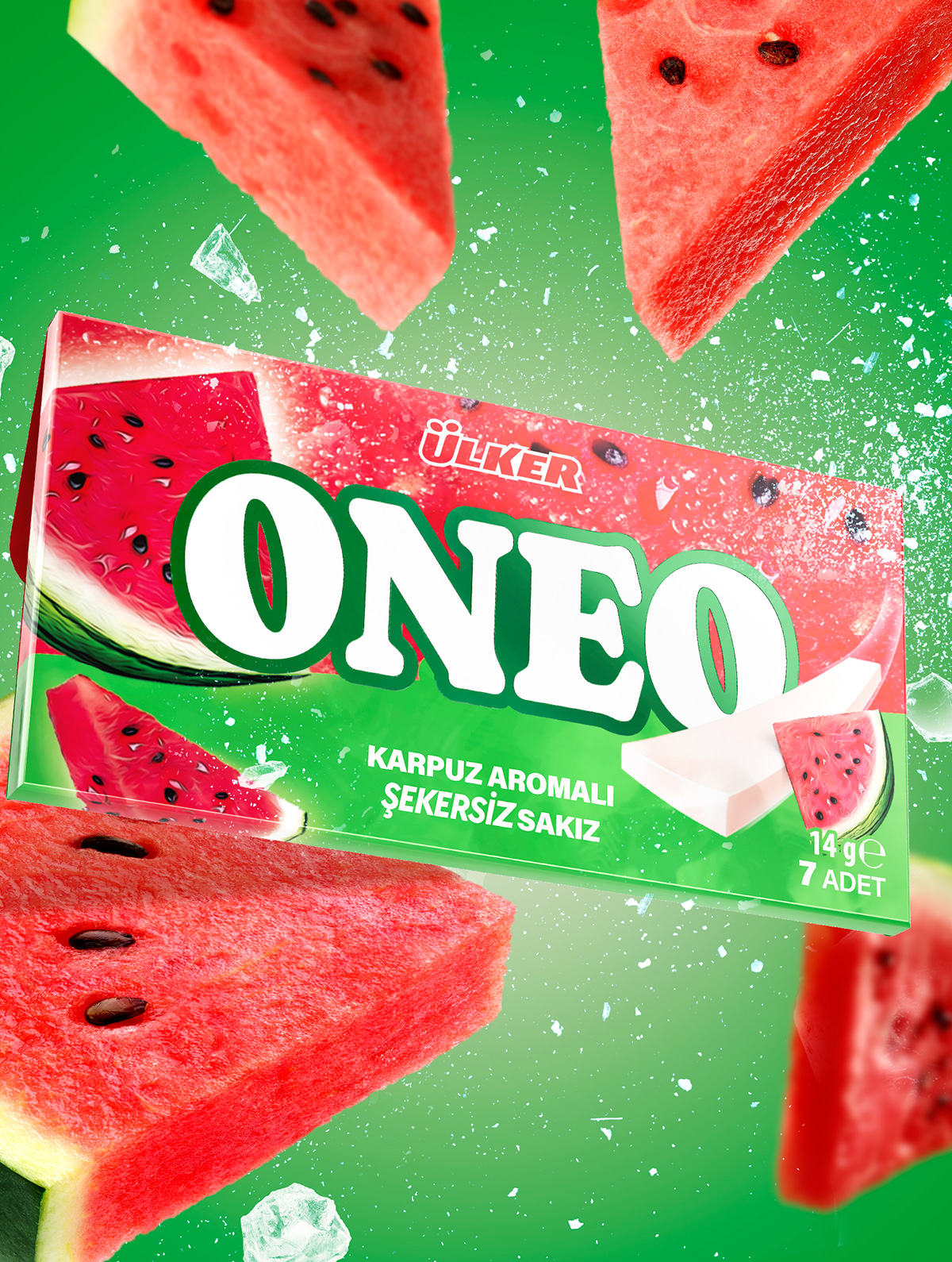
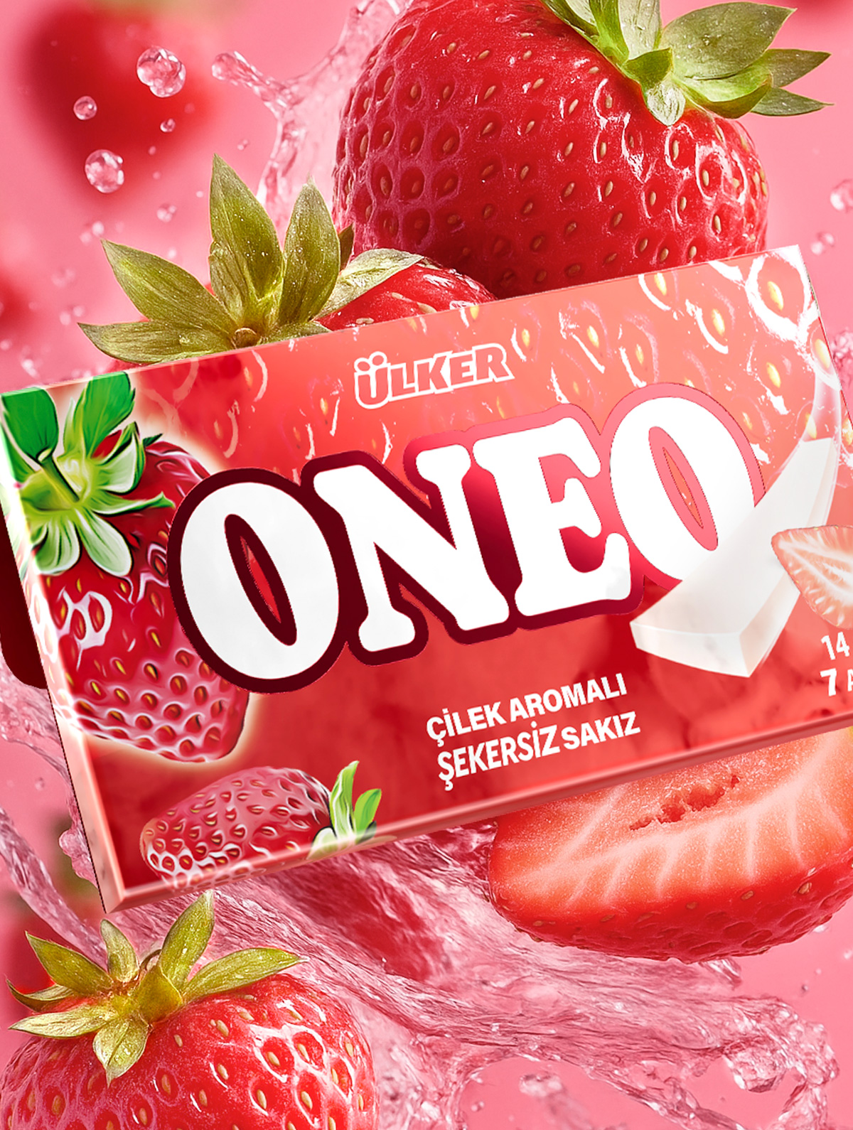
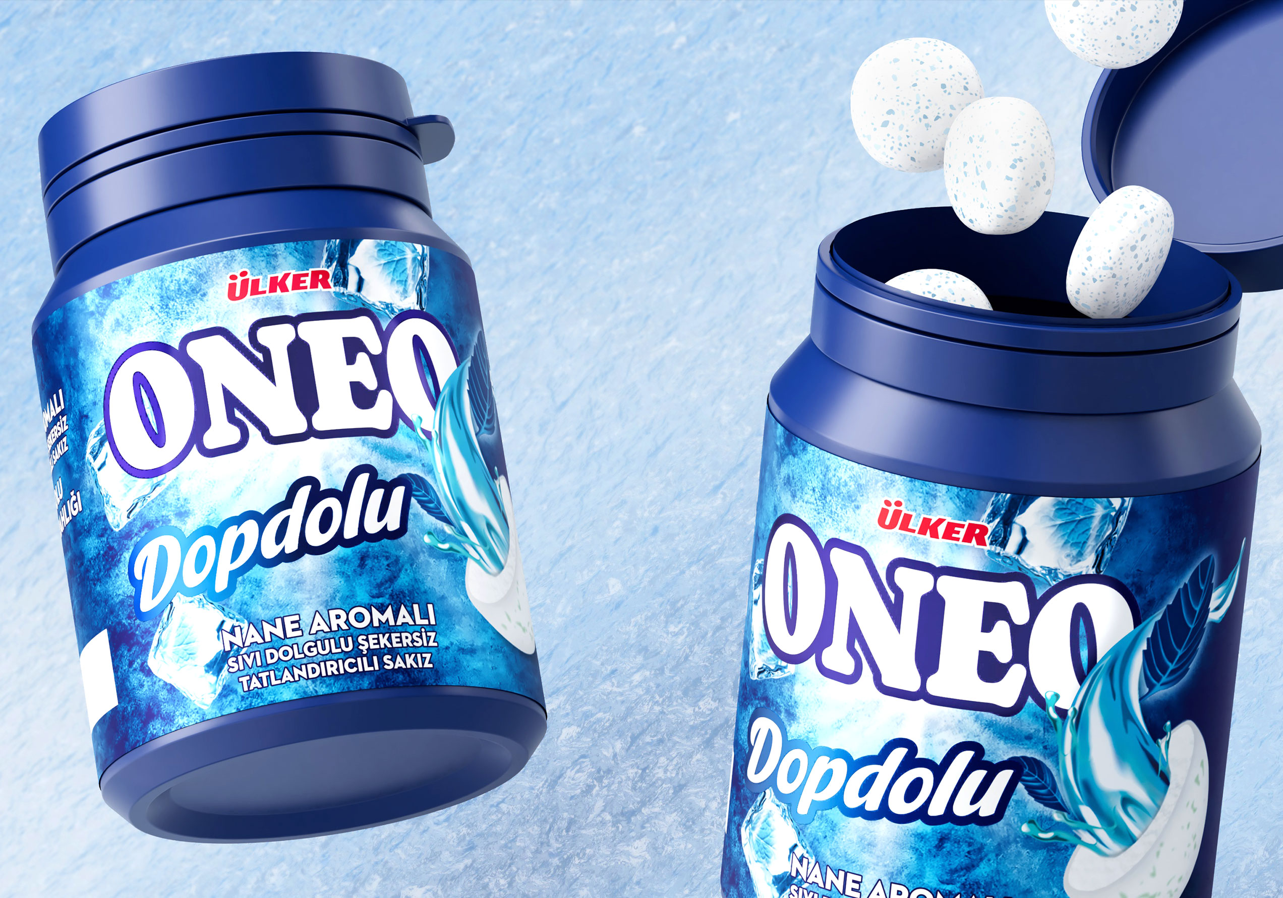
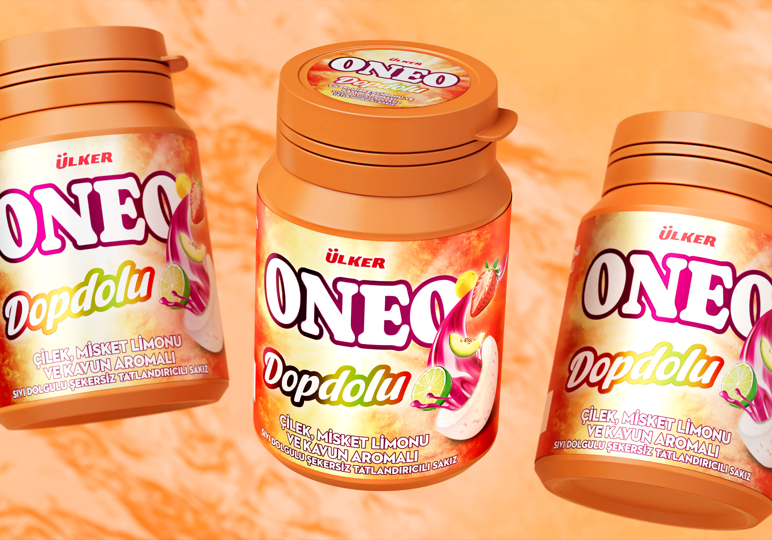
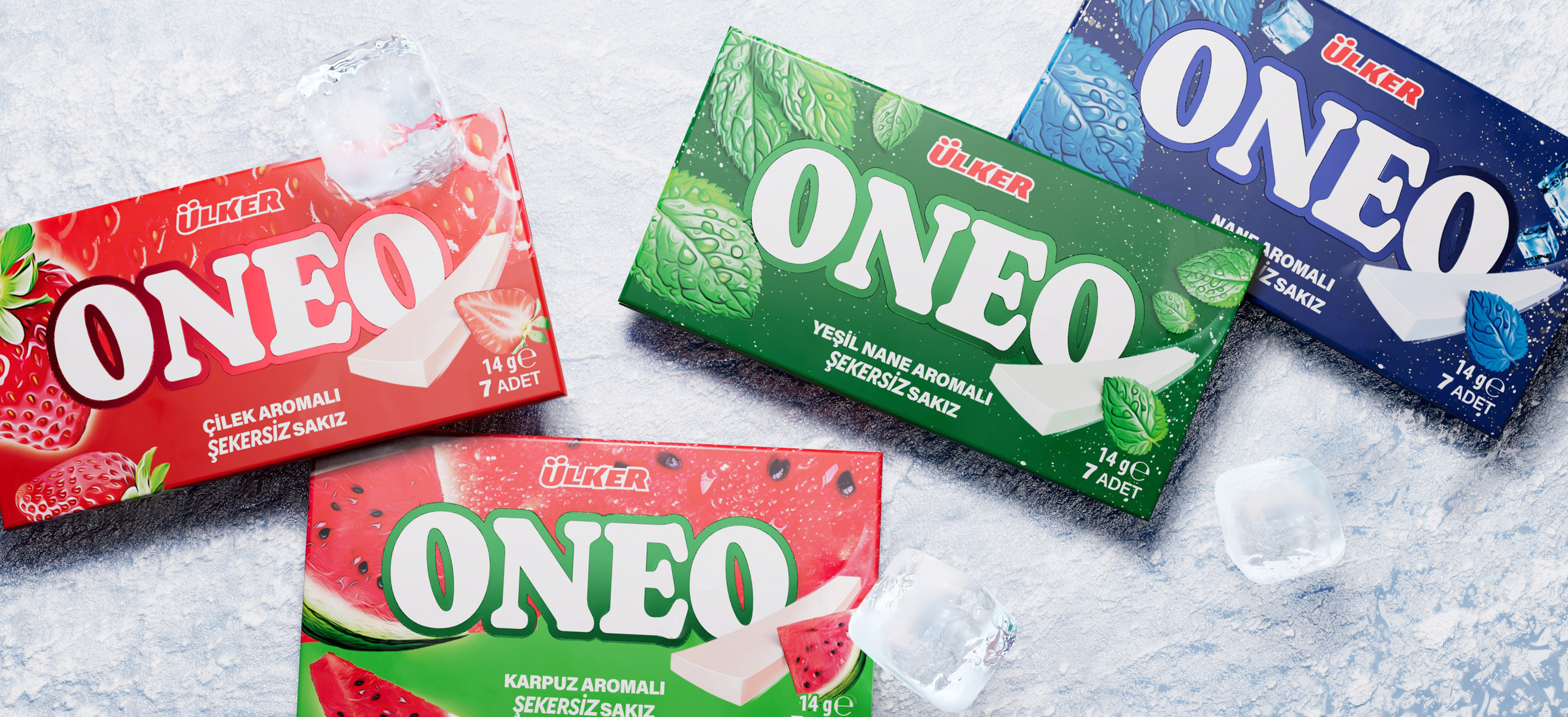
Spider worked across all elements with an approach focused on streamlining and refining the brand’s overall look. The logo, now bolder and more legible thanks to a minimal background, stands out on the front pack, immediately grabbing attention. Slim packs feature a glossy finish and raised foil lettering, also replicated on the candy carton packs. Freshness is further amplified in the flip-top jars for filled candies, thanks to a shimmering sleeve. The SKU icons were also revamped to convey a cleaner, more streamlined look.
Freshness in every form.
The packaging system works seamlessly across all formats, from slim packs to carton boxes and flip-top jars and allows for flavor variations and line extensions.
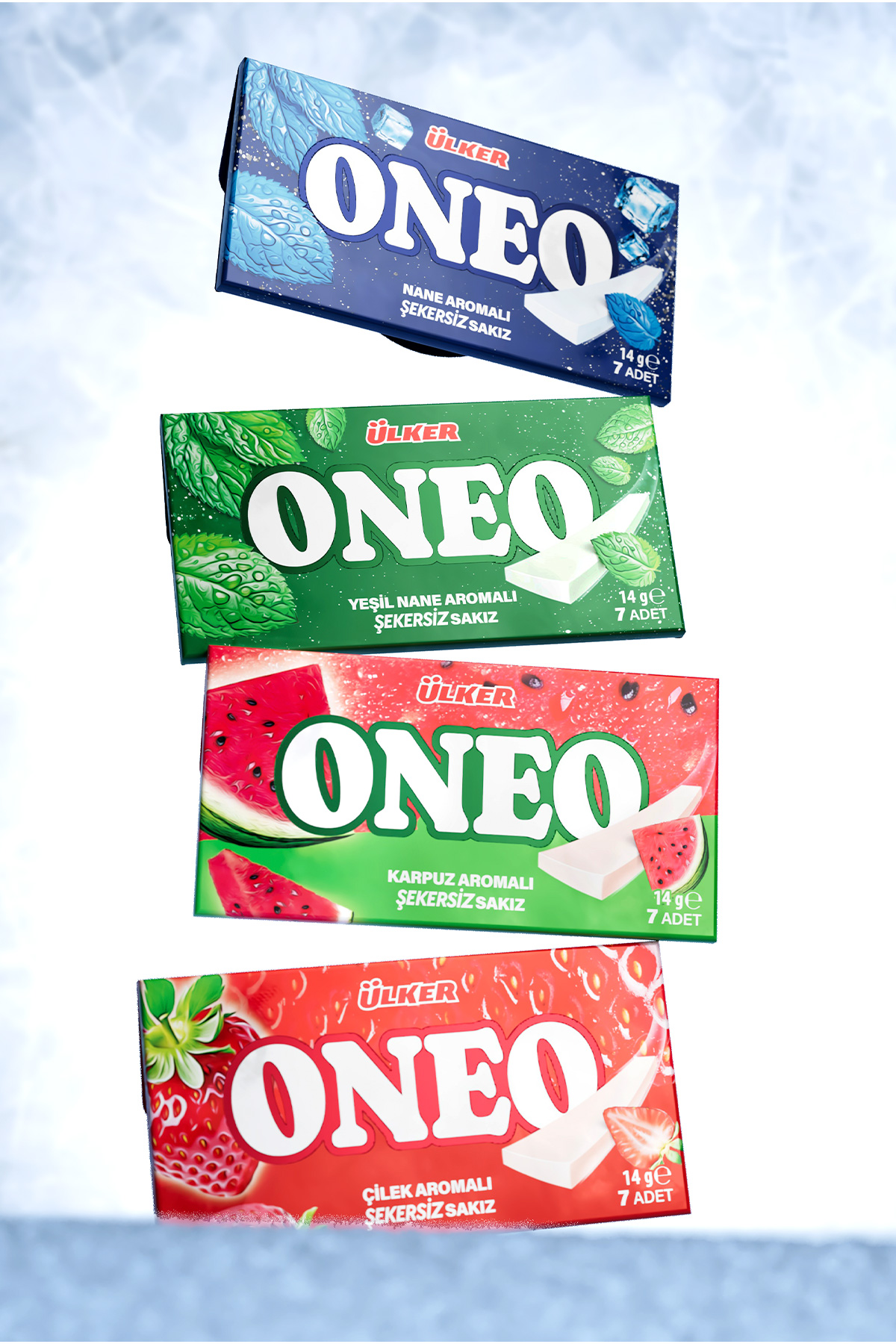
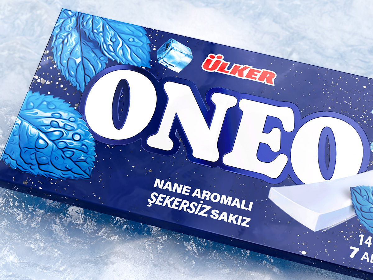
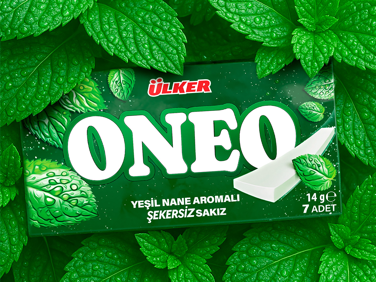
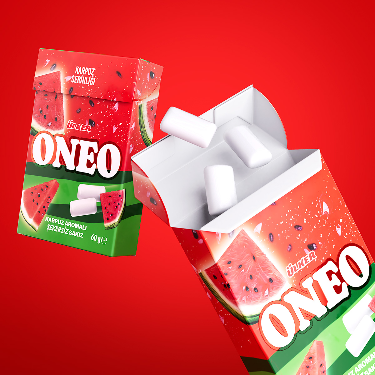
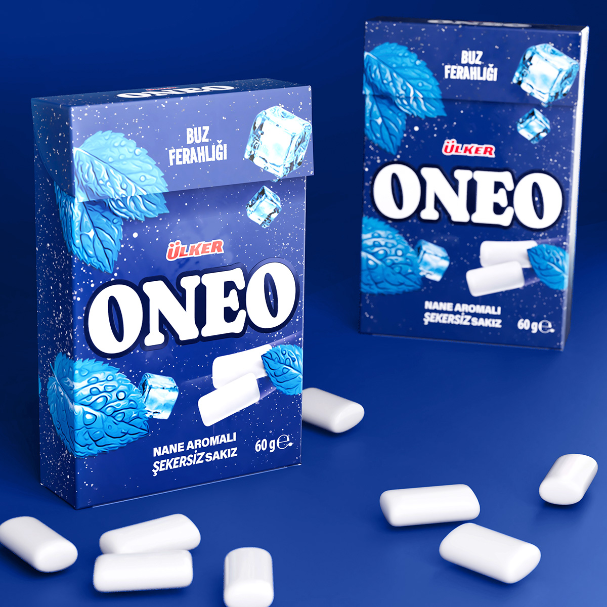
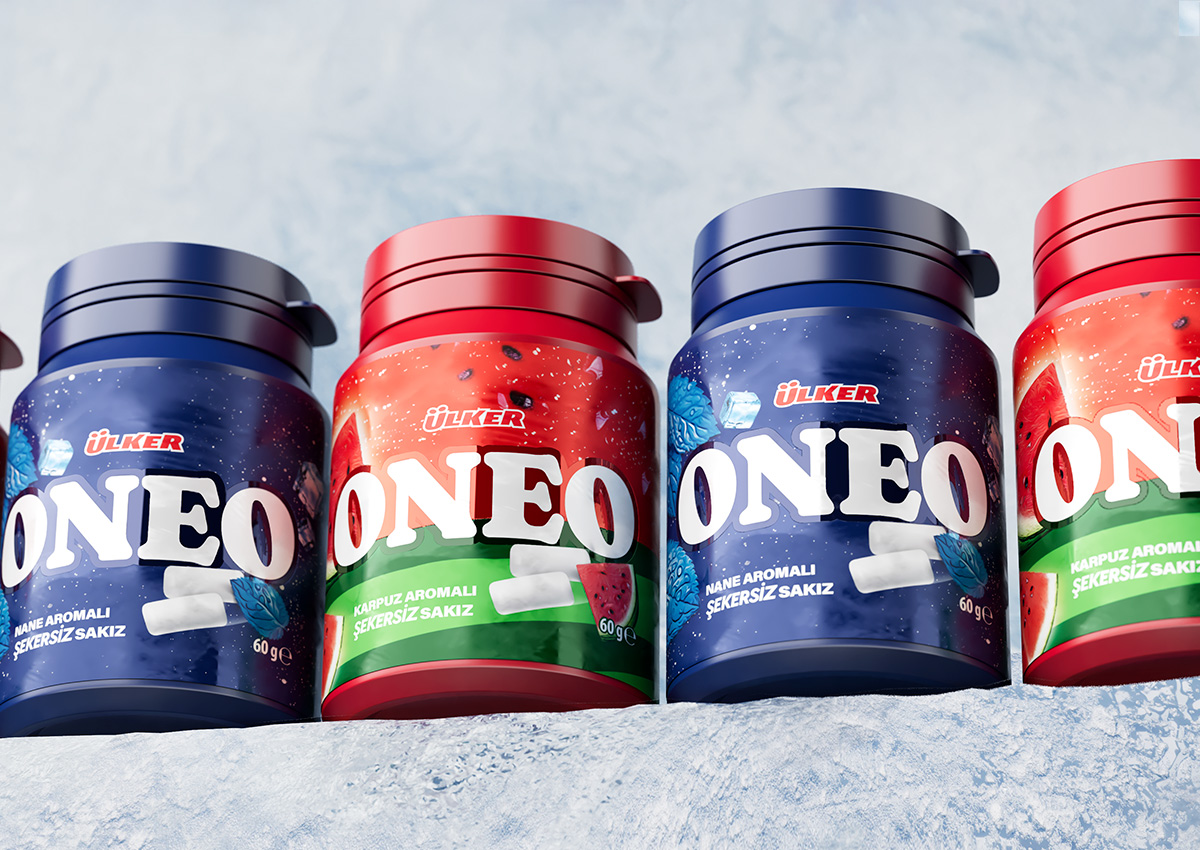
The shades of blue, green, and red are bright, vivid and consistent with the brand’s established color codes, maintaining recognition while refreshing the look. To optimize appeal, visibility, and overall impact, Spider conducted consumer tests to identify the solution that best balances the brand’s heritage with its fresh new vibe.