Hogareñas
Design, back in bloom.
For the restyling of Hogareñas’ cracker range, part of the Arcor group, Spider developed a design that helps the brand evolve into a more contemporary and recognisable expression, bringing out the core elements of its positioning and reinforcing its natural appeal without compromising on flavour.
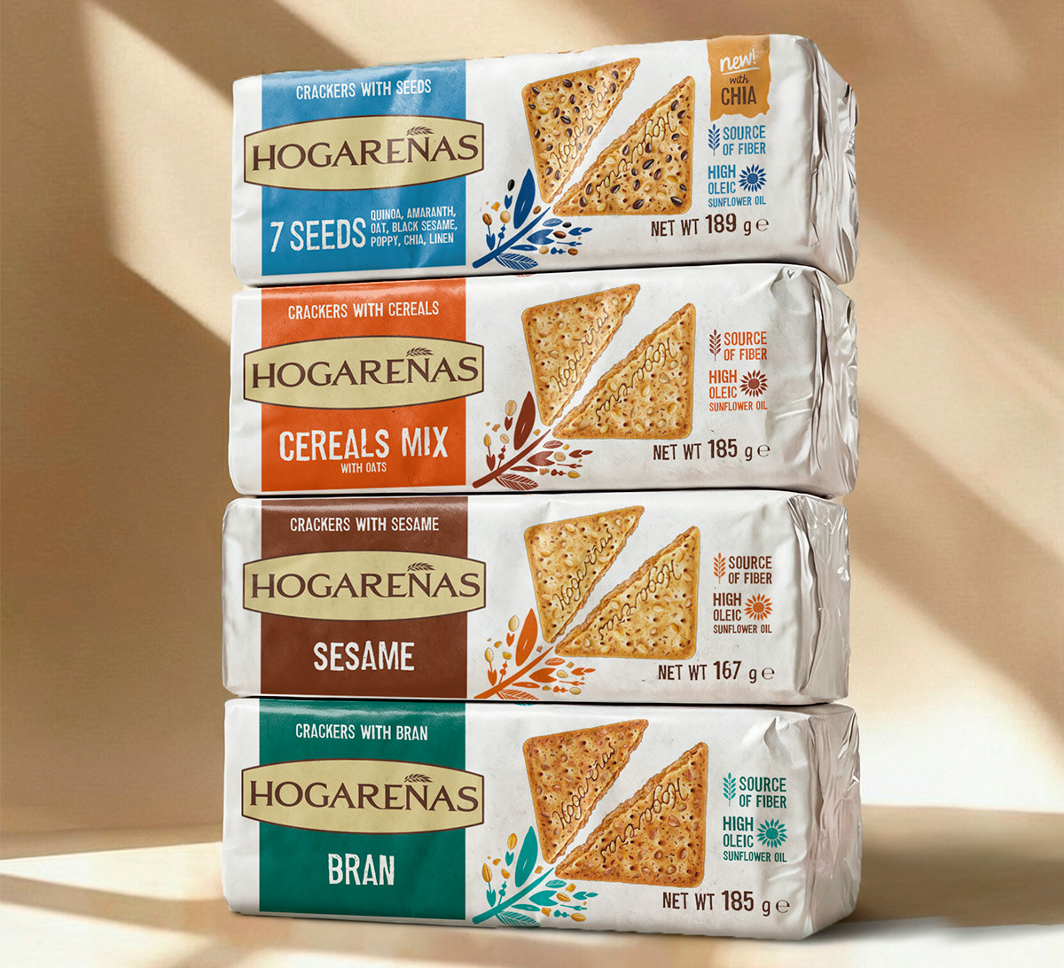
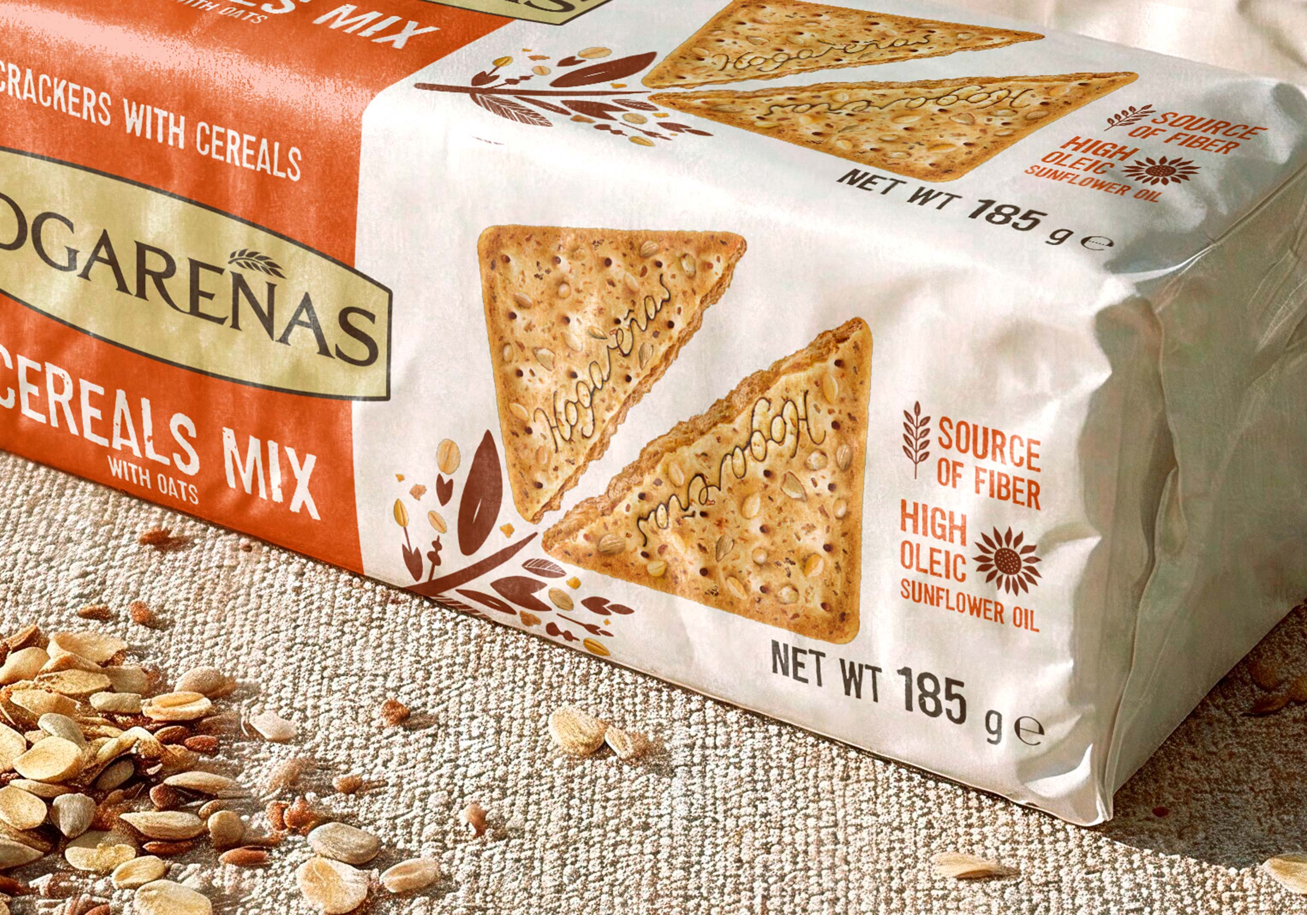
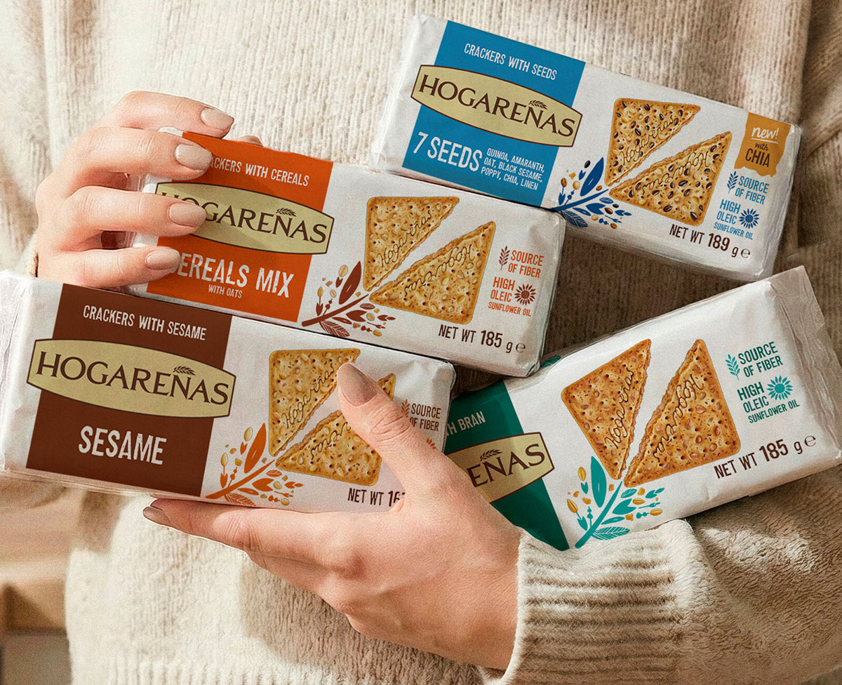
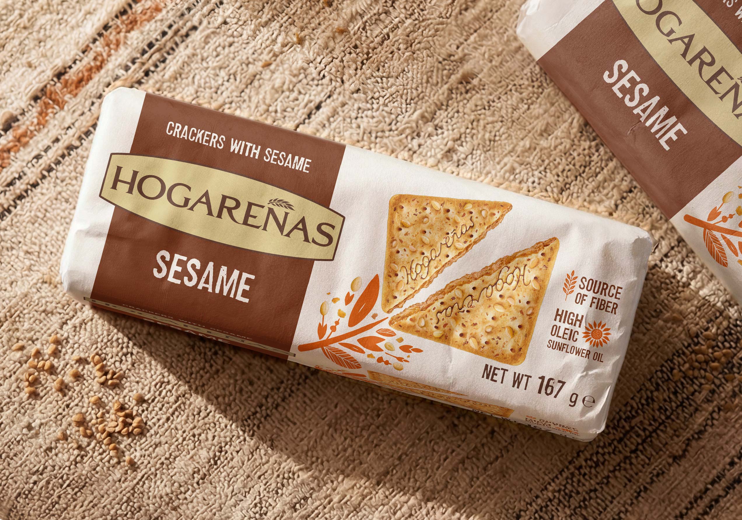
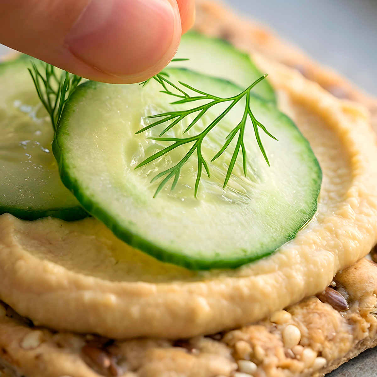
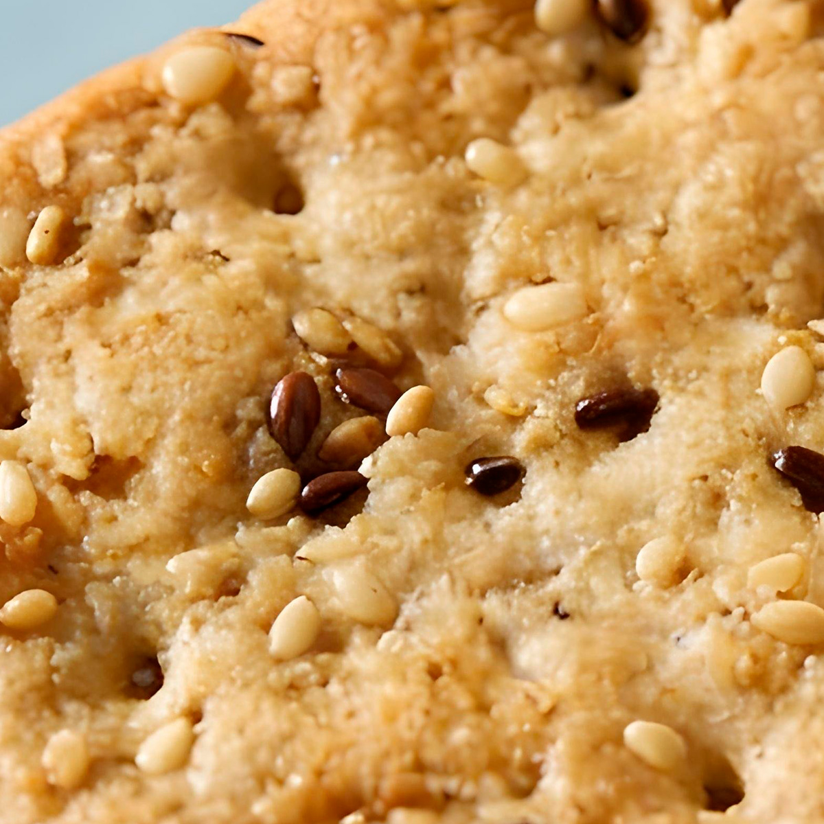
White sets the new visual code for the range: it improves pack readability and creates a cleaner, more effective space for the product to take centre stage. The new visuals, richer and more appetising, immediately highlight the product’s shape, making crackers and ingredients the true heroes of the pack.
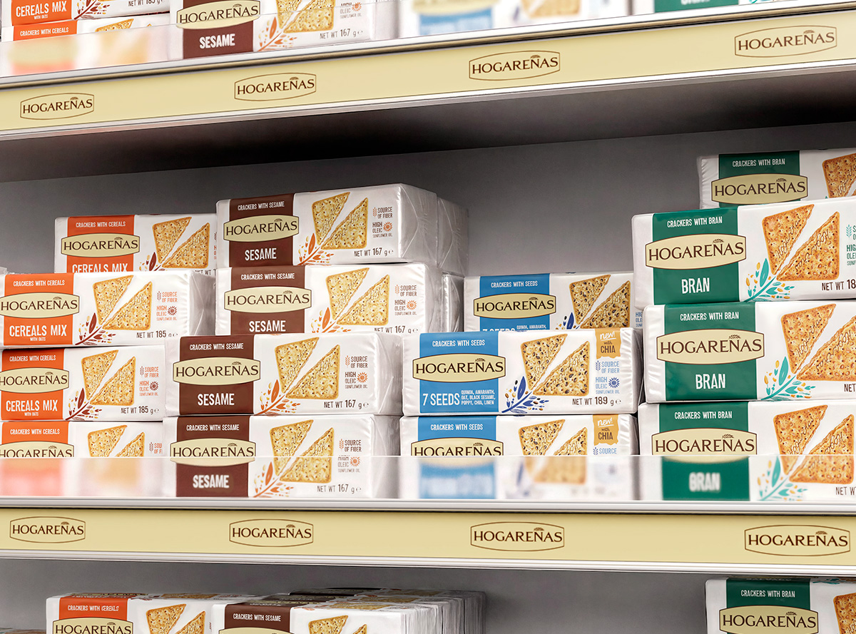
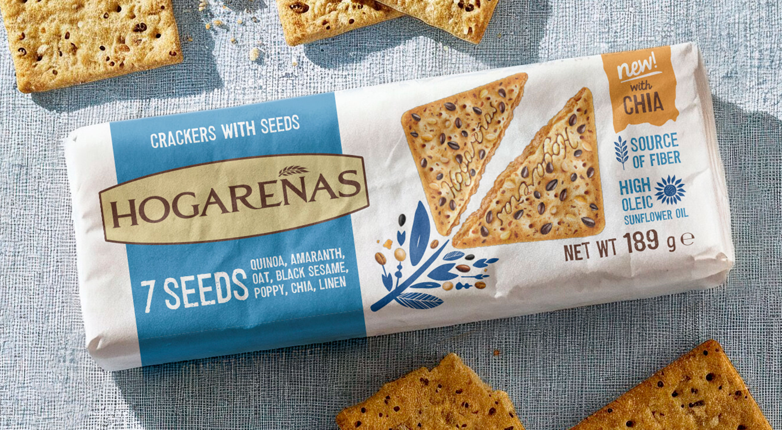
A nature-inspired story blooms around the product: vibrant floral illustrations create an iconic key visual, while dedicated colour codes give each SKU its own clear identity.
The result is a more modern, consistent and memorable range, one that conveys the product’s naturalness through a simple and authentic language.
The result is a more modern, consistent and memorable range, one that conveys the product’s naturalness through a simple and authentic language.