
Loacker
Some challenges take us higher than others.
LOACKER’S REQUEST: UNIFY AND DIFFERENTIATE.
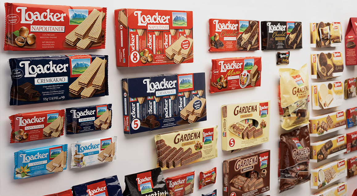
Mountains always inspire great adventures. Take Loacker, a family-owned company situated at 1000 meters above sea level, where the air and water remain mostly unpolluted. Although logistically inconvenient, this location is perfect for producing the high-quality wafers and chocolate specialties Loacker is known for. With over 200 references topping consumers' rating charts worldwide and a distinctive packaging that has undergone only minor touch-ups in the last 30 years, rebranding and designing a new packaging system was a significant task for Spider. Over a three-year period, we embarked on a journey akin to climbing Mt. Scillar, a peak that Loacker admires daily from its windows.

A constantly
driven upward.
BRAND UNITY AND PRODUCT DIFFERENTIATION
Our task was to strike the right balance between the vertical integration of the "Loacker" brand and the differentiation among its various product lines. Through preliminary work and ongoing dialogue with the company, Spider has identified several strategic approaches and tested the most efficient proposals using five iconic products. Neuroscience techniques, such as measuring consumers' attention on shelves and packaging zones, were employed, followed by POS market tests, leading to a final choice visible on store shelves today.
Tests and analysis developed by Brainsigns and Dialogica.

The final view following the ascent.
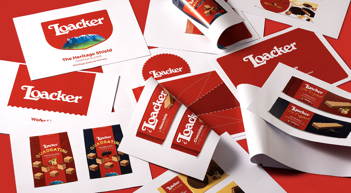
THE HERITAGE SHIELD.
Incorporating Mt. Scillar's image into the new logo as a blazon symbolizes the brand's identity and fundamental values. The Heritage Shield, inspired by Loacker's historical emblem, reflects the label's essence, including family, origin, and nature, with the altotesine peak silhouette characterizing Loacker distinctively.

Common DNA and
uniqueness of each
and every product
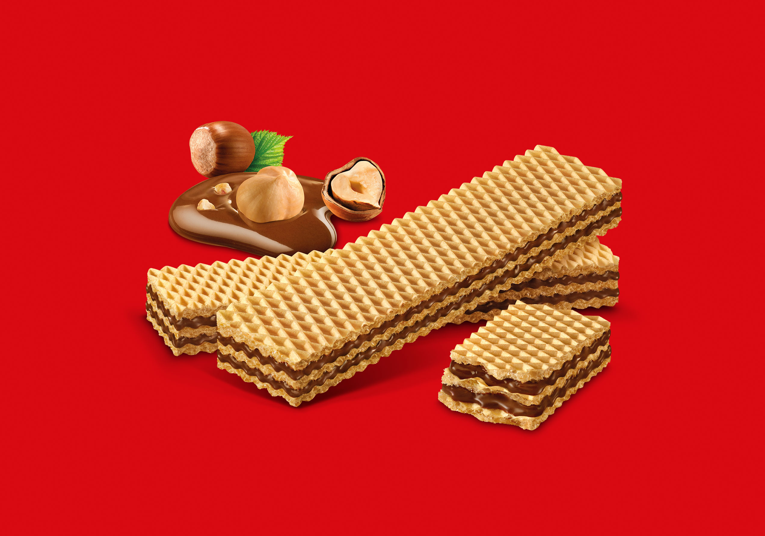
By utilizing the Heritage Shield, we highlighted brand identity and recognizability while enhancing every product assortment and reference. Each flavor and product family was described to convey natural simplicity and redefine the brand and product architecture.
All images were realized featuring studio +Luce.
An explicit packaging system
in coordination with all ranges.

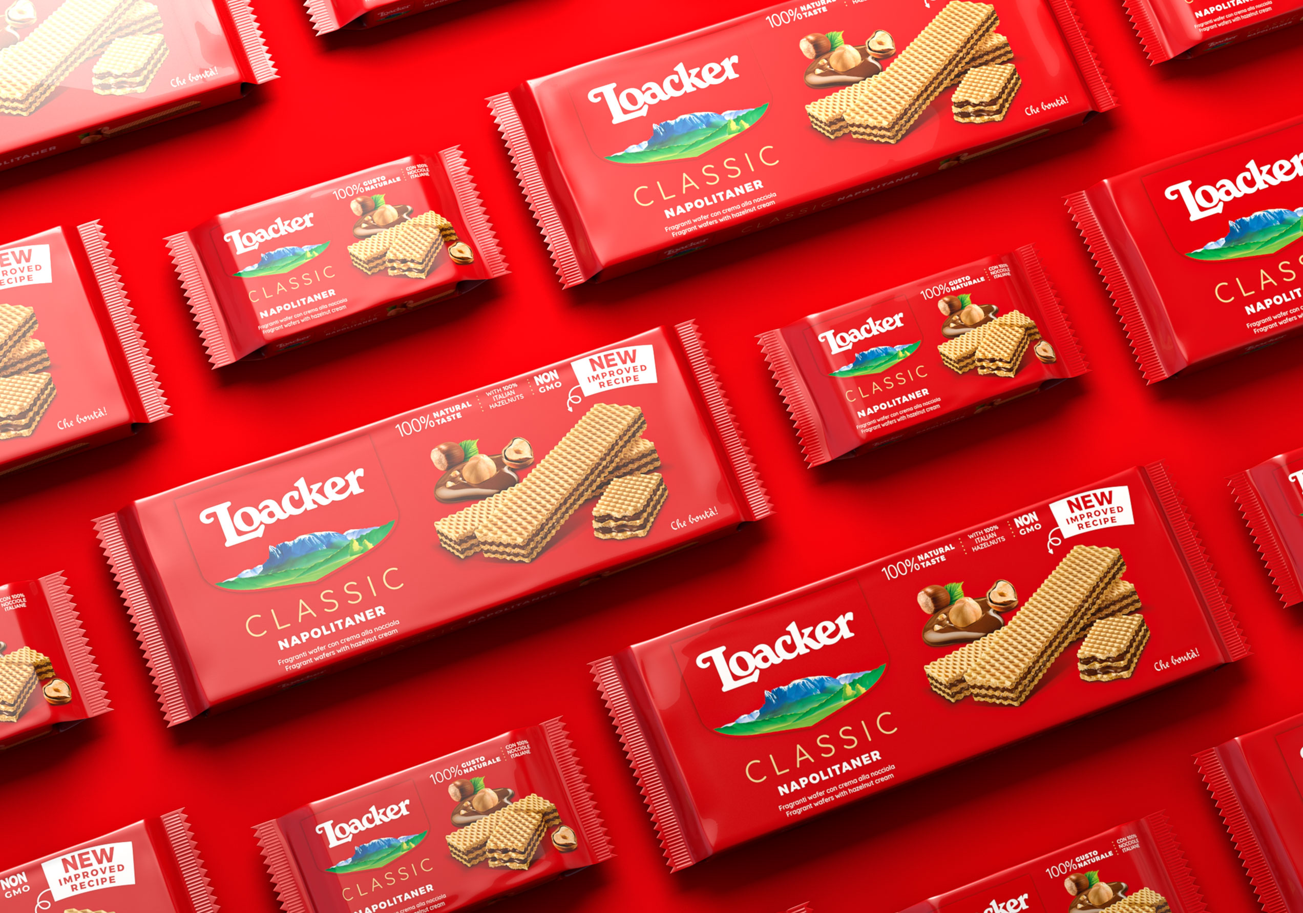
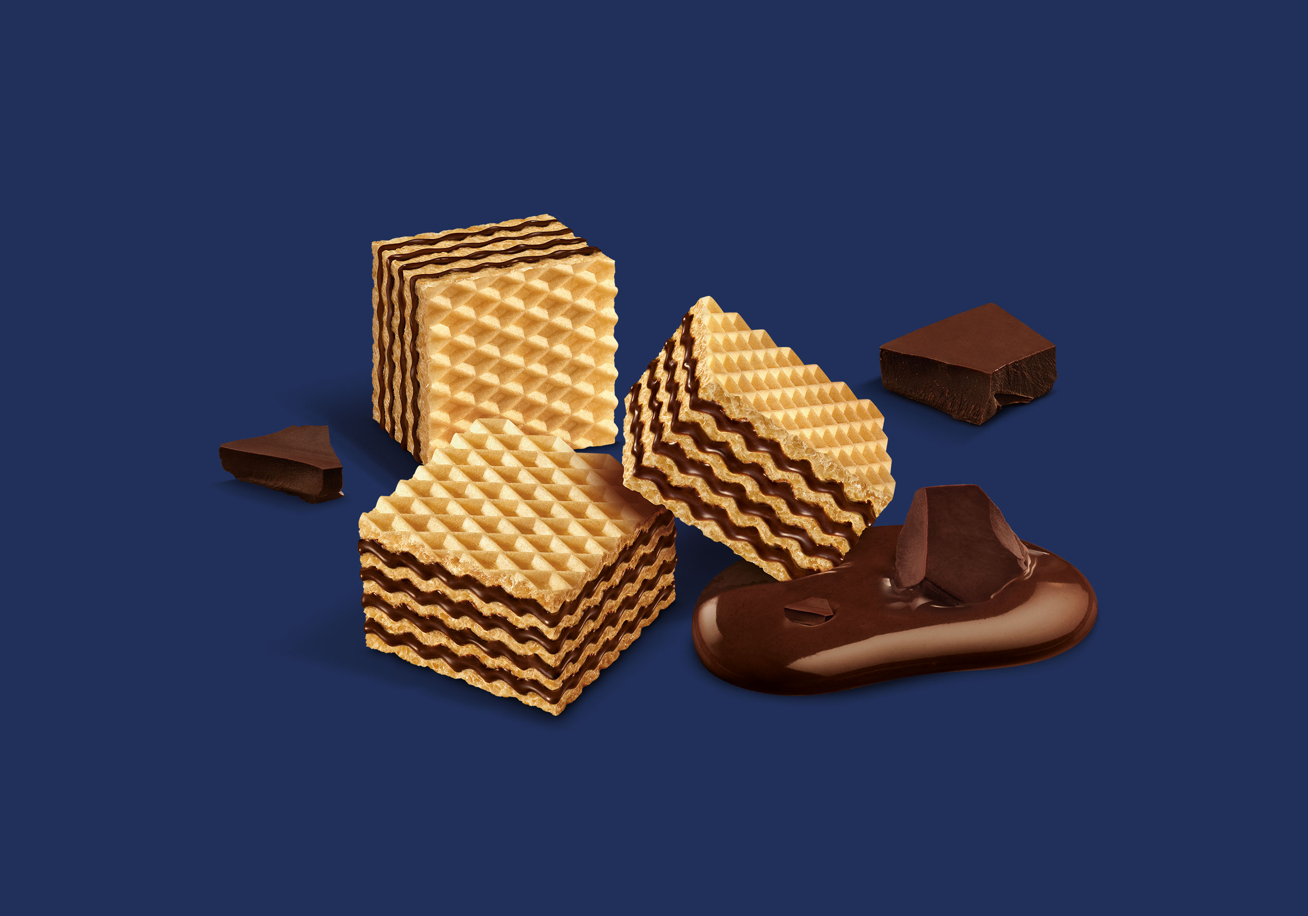
Product representation became realistic and straightforward, showcasing natural deliciousness. The historic claim "Che bontà" was passed onto each reference, with a QR code redirecting to brand and product storytelling. Redefining element hierarchy resulted in a clear and adaptable system, ensuring products are not only good but also visually appealing.

A new packaging deferential
to its own past.
The change is made visible by the unified and appealing design, which improves of the 20% the Loacker’s brand visibility on the shelves, meanwhile ensuring a more straight forward and differentiate positioning for each of the product range and reference, so that the consumer is able to orientate quickly while shopping.
This is why Loacker, on one hand increases the highlight of the brand and the goodness perceived, and on the other hand it becomes perfectly recognizable by those who always loved it.


