Image

Loacker Quadratini

So much goodness to share!

BRAND STRATEGY BRAND IDENTITY NAMING AND WRITING PACKAGING DESIGN

GOODNESS TO THE SQUARE, MULTIPLIED FOR THE PACK AND DIVIDED BY FLAVOR.

The new result achieved thanks to our rebranding and new packaging design project, especially developed for Loacker.
This time the operation involved Quadratini: the latest icon of the Brand, another way to tell of Loacker’s World, ever giving great recognition to the brand while emphasizing the different recipee. Five crispy wafers and 4 creamy layers to provide the flavor of a different experience, invariably unmatched.

Bite-sized and at hand.

Tiny concentrates of goodness in a practical pouch that we have re-interpreted accordingly to the new pack system’s guide lines and developed specifically to be able to function properly in both horizontal and vertical formats.
The Quadratini range logo’s re-design and the creation of its key visual, allows to have each product and its ever changing ingredients, color and filling, right on the spotlight.
Starting with the Napolitaner flavor, the classic par excellence, currently available also as Quadratino, another way to enjoy it, commencing by its amazing pack.
Image
Image

Plenty of delights
within minimum space
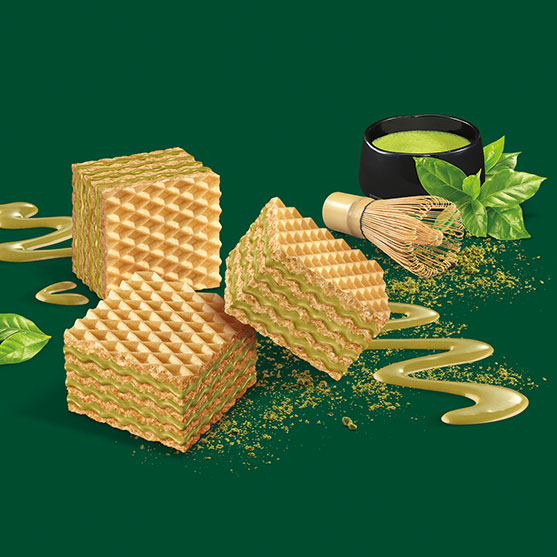
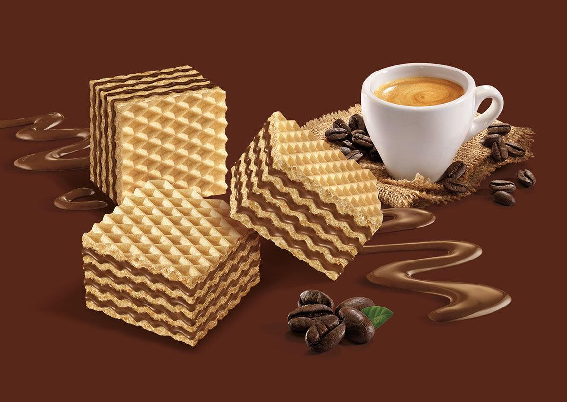
Little irresistible pleasures, today in a reduced format, perfect to travelling or just to hold in the office.
We have searched for a yummi distinctiness, defined by flavor identification and expressed through ingredients and colors which perfectly signify them. The filling, which seems to have been poured from a spoon, enhance in an acctractive way all fruit based recipee, dark chocolate and every delicacy in there.


Image

Even more special.

In order to tell and differentiate the specialties we have created some creamy backgrounds starting from the different recipee, so to express the embracing shades of each filling, the pleasantness of its taste and the authenticity of its ingredients, described in the texts as well. A Pastry Chef’s Decoration made with the same filling, ideally underlines the hart of every recipe.


Image
Image
Image
Image
For all fruits and yogurts’ recipee we have chosen a fresh and clear differentiation, “clean” and contemporary. This being also a way to transmit semplicity and wellness which are enclosed in the ingredients of use: yogurt made with Milk from the Alps, raspeberries riped in the sun, hand picked blueberries grown outside.
Image
Image
Image

Other projects:

A presentation worthy of a Chef.

Recharge yourself while chewing.

Keep in touch to receive Spider’s news.

SPIDER S.A.S. DI MARCO VENTRICE & C. - Sede legale: Via Venturello 8, 10098, frazione Cascine Vica
P.IVA 10019550010 - SDI: W7YVJK9 - Iscr. Reg. Imprese TO-325906 - Cap. Soc. € 500,00 I.V.