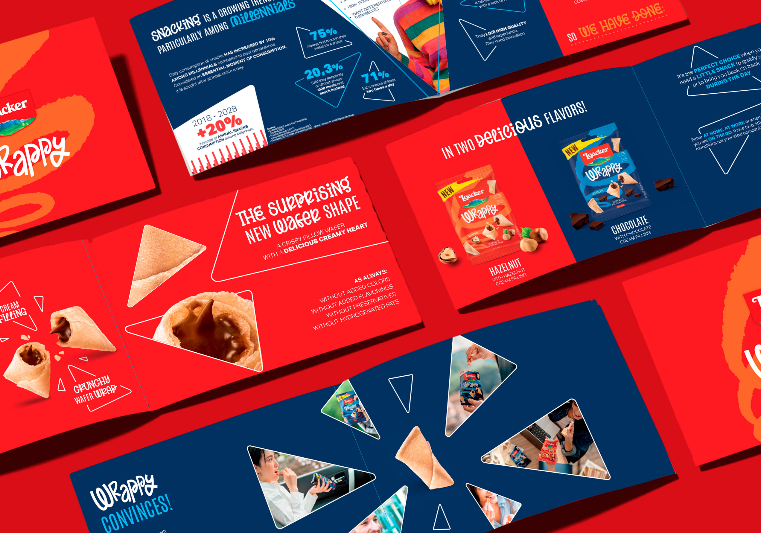
Loacker Wrappy
An identity with a flavor that embraces.
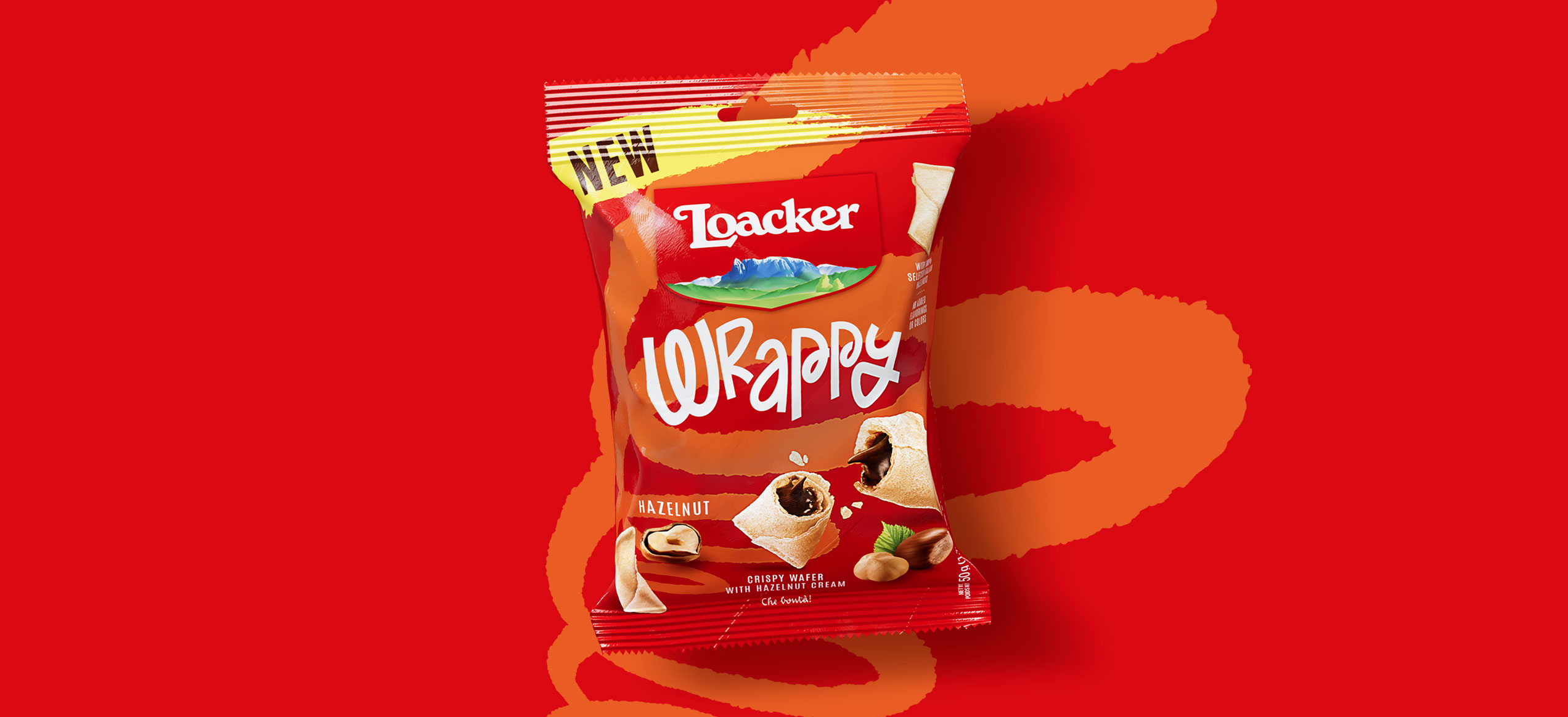
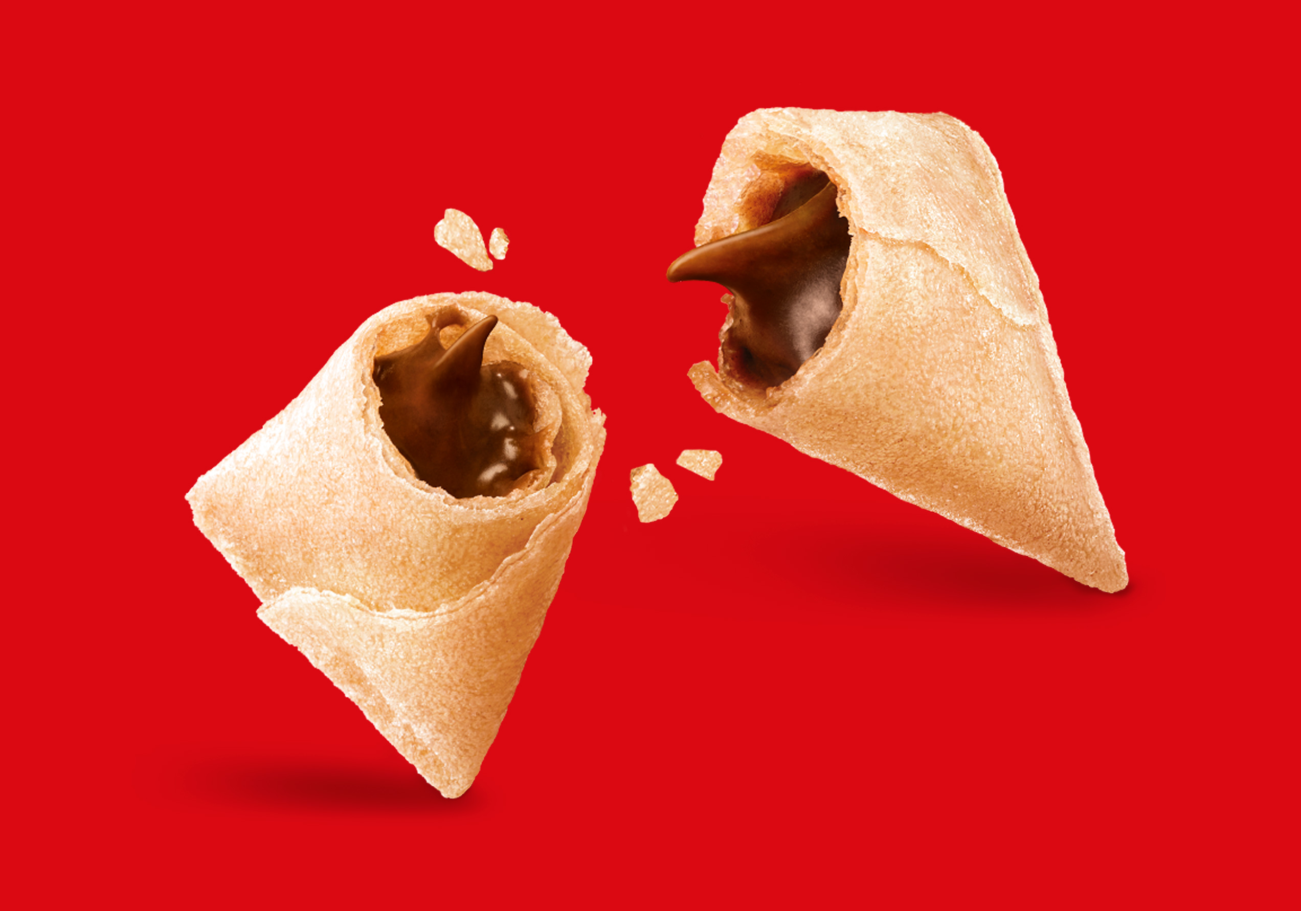
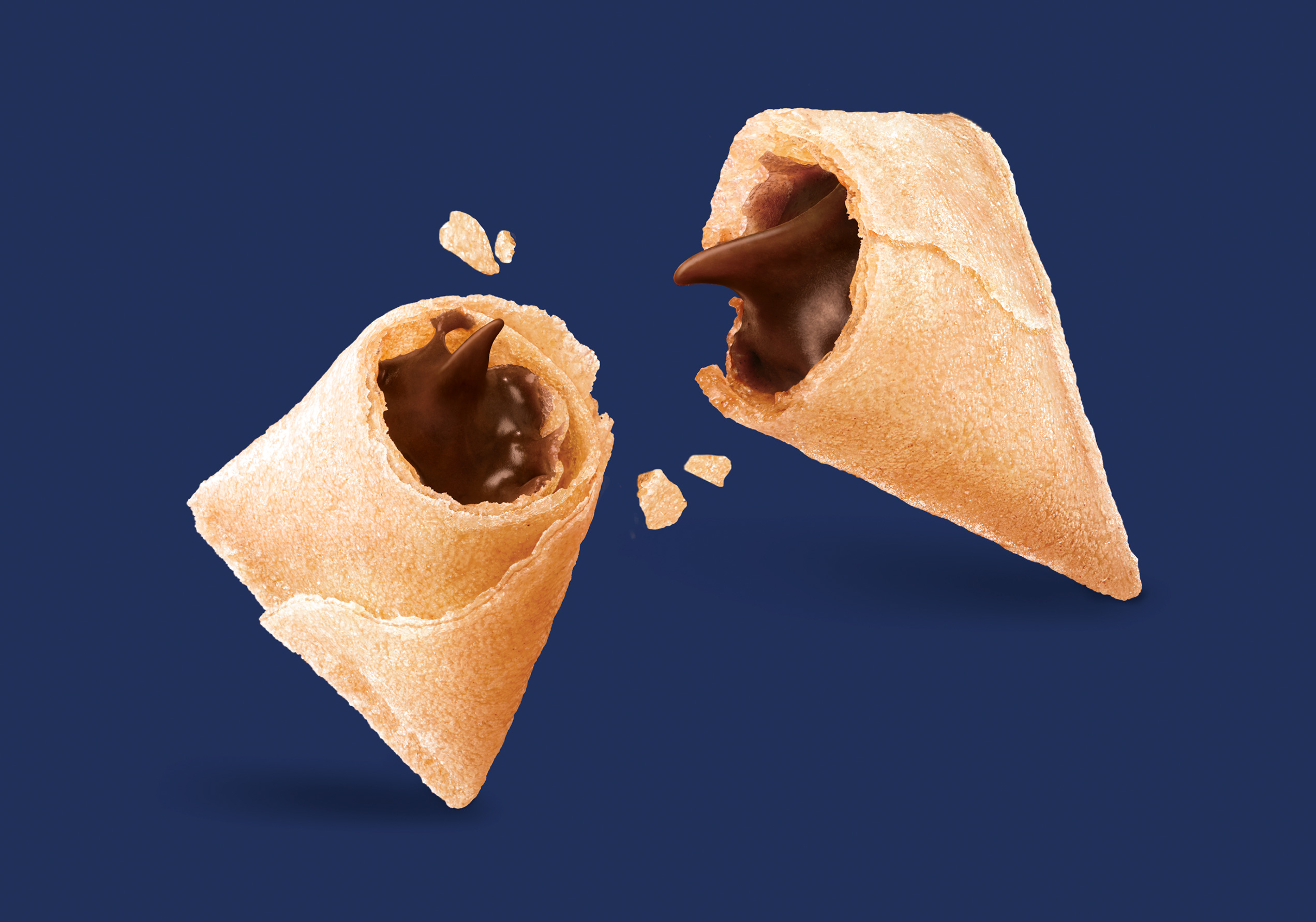
A delicate wafer shell cradling a creamy heart, an easy-to-carry snack made for sharing: if goodness has many forms, this is surely the most surprising. From logo creation to key visuals and packaging design, Spider has developed the brand identity of Loacker Wrappy, bringing a swirl of irresistible indulgence to the shelves.
Filling every pause (Re-filling every moment)
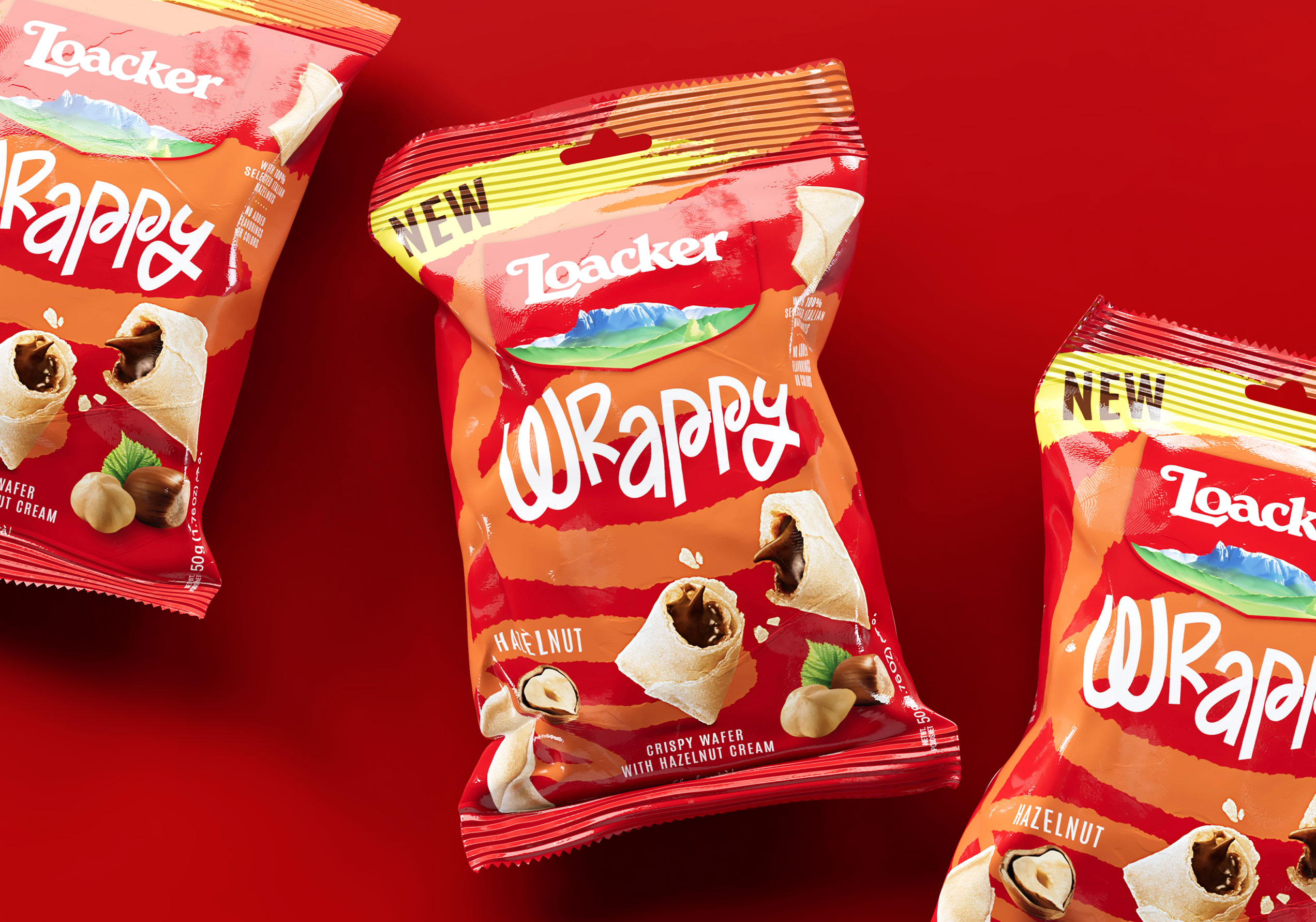
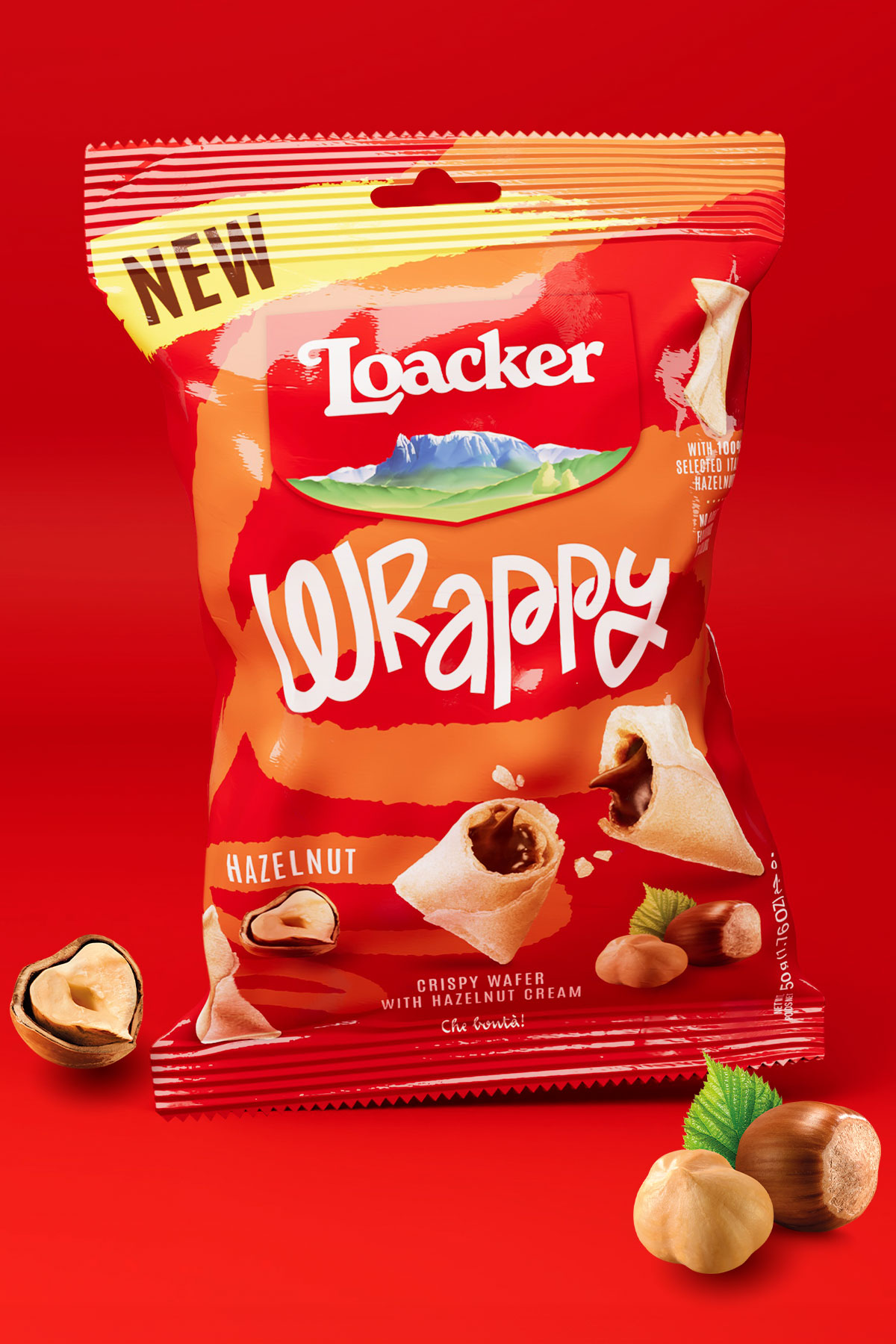
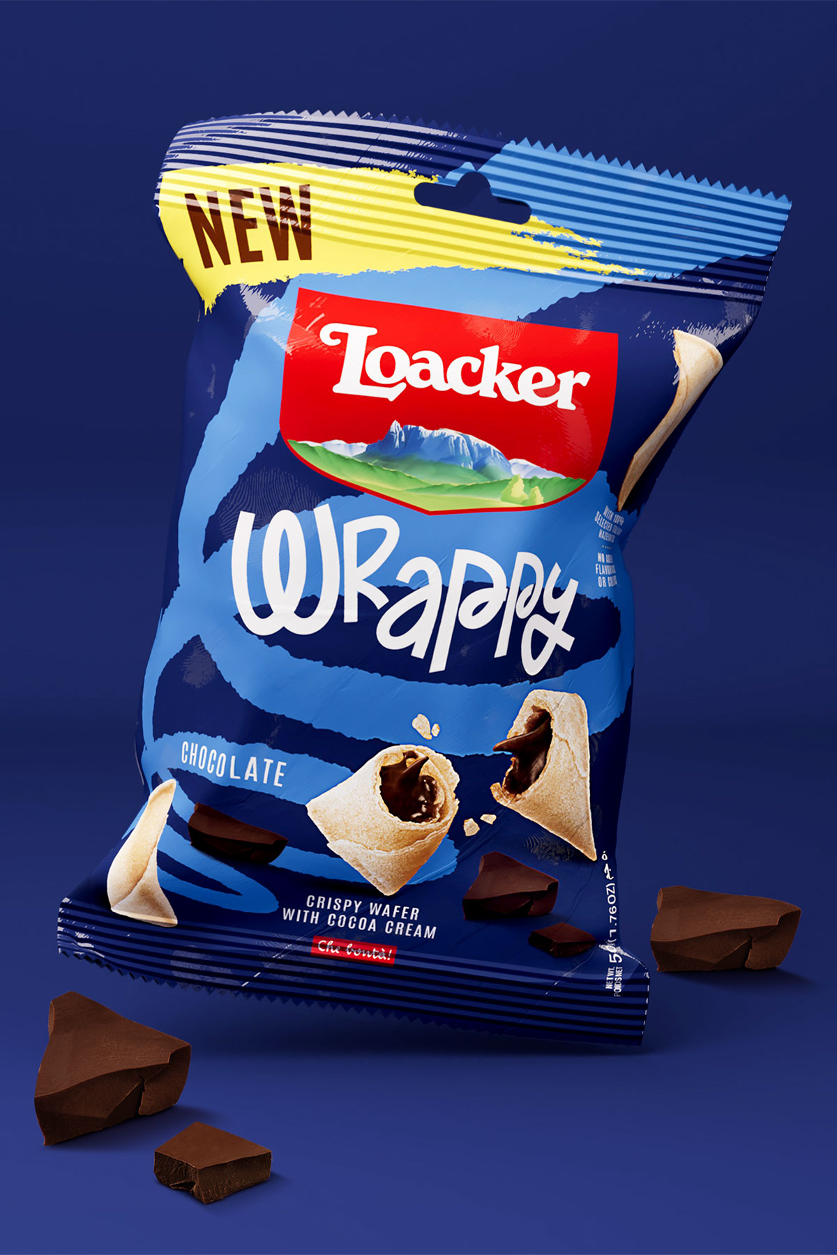
The cheerful and fun brand identity targets young adults looking to sweeten everyday life, no matter where they are. With bold red for hazelnut-filled Loacker and cool blue for indulgent chocolate cream, the image has been adapted to two SKUs. Spiraling, colorful backdrops, drawn from Wrappy's immersive design language, highlight the creamy textures and rich fragrances of the products upfront.
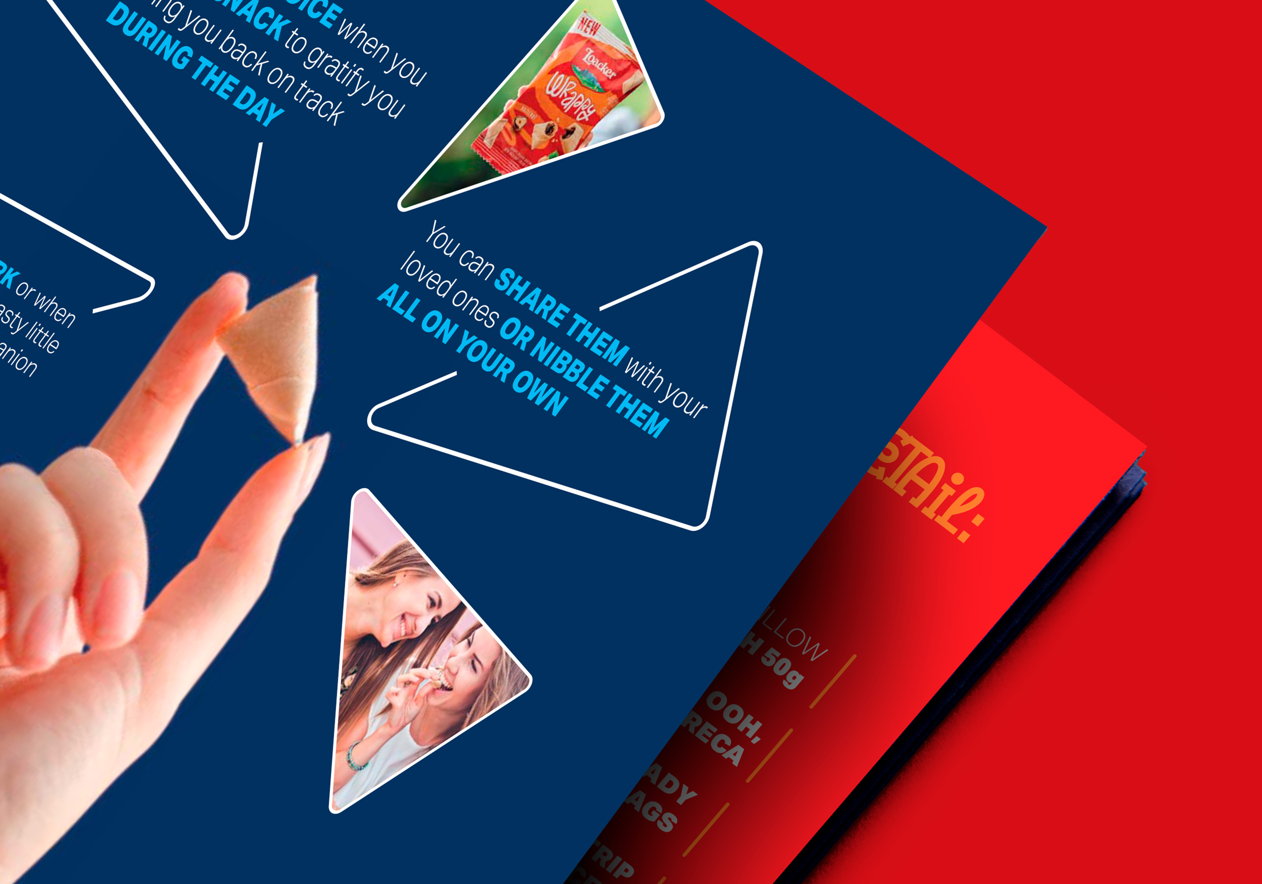
Dynamic visuals and Wrappy’s iconic shape extend effortlessly to trade communication. The trade folder teases the pocket-sized wafer as the perfect companion for any break, whether you’re relaxing at home, powering through work, or catching a quick snack on the go.